Bipartite Graphs
Shuji Sato, Kazuo Misue, and Jiro Tanaka Department of Computer Science, University of Tsukuba,
1-1-1 Tennoudai, Tsukuba, 305-8573, Japan
[email protected],{misue,jiro}@cs.tsukuba.ac.jp
Abstract. Bipartite graphs appear in various scenes in the real world, and visualizing these graphs helps improve our understanding of net- work structures. The amount of information that is available to us has increased dramatically in recent years, and it is therefore necessary to develop a drawing technique that corresponds to large-scale graphs. In this paper, we describe drawing methods to make large-scale bipartite graphs easy to read. We propose two techniques: “node contraction draw- ing,” which involves collecting similar nodes and drawing them as one node, and “isosimilarity contour drawing,” which puts clusters into an outlined area. We developed interactive user interfaces for the drawing methods and conducted an evaluation experiment to demonstrate the effectiveness of the proposed techniques.
Keywords: information visualization, graph drawing, bipartite graph, anchored map, clustering.
1 Introduction
With the spread of information services, the quantity of information that can be obtained has been increasing significantly. When people obtain knowledge from information, their understanding is strengthened by extracting and “visualizing”
the information. Therefore, research on visualization techniques is being done in various fields. However, using common methods, the larger the amount of data becomes, the lower the readability is of the visualization results. Thus, we need to investigate new visualization methods.
The purpose of this research is to improve “readability” in the visualization of large-scale graphs. For the representation of a large-scale network using tech- niques used to draw anchored maps [1,2], we aim to improve readability by adding new representations of specialized techniques for large-scale graphs.
2 Previous Knowledge
2.1 Bipartite Graphs
A graph is a logical structure composed of a collection of nodes and a collection of edges that connect pairs of nodes, and is befitted to represent associations
I. Lovrek, R.J. Howlett, and L.C. Jain (Eds.): KES 2008, Part II, LNAI 5178, pp. 831–838, 2008.
c Springer-Verlag Berlin Heidelberg 2008
832 S. Sato, K. Misue, and J. Tanaka
between some objects. A bipartite graph is a graph whose node set V can be divided into two disjoint sets V
1and V
2such that every edge e( ∈ E) connects a node in V
1and one in V
2, and we have G = (V
1∪ V
2, E). As in the example of relations between customers and commodities and between academic papers and authors, bipartite graphs appear in various real-world scenes, and they also appear in research fields [3]. In this paper, we focus on the networks represented as bipartite graphs.
2.2 Anchored Maps
One of the most common methods used to draw graphs is the spring embedder model proposed by Eades [4]. This model calculates a stable state of a virtual physical model that has been constructed by regarding edges in a graph as springs.
An anchored map is an advanced form of the spring embedder model, and it restricts nodes in one of two node sets of a bipartite graph to certain positions.
– Nodes in V
1are arranged at even intervals on the circumference, and then – Nodes in V
2are arranged by the spring embedder model, with a suitable
position to represent their relationships to nodes in V
1We call nodes in V
1“anchors” and nodes in V
2“free nodes.” Edges are repre- sented in a way that connects the anchors and the free nodes in a straight line.
Fig. 1 shows the visualization result of the network of relations between academic papers and their authors by using anchored maps. Authors are represented by rectangles and are fixed as anchors.
To improve the readability of anchored maps, anchors are arranged so as to reduce edge crossings and/or edge length
1. However, when we draw a large-scale graph as an anchored map using the previous method [1], some problems occur in readability (see Fig. 1(b)). Large-scale graphs have a lot of nodes and edges for the drawing area, so the method of arranging the node layout makes it difficult to improve the readability. In previous studies a method of increasing the resolution of the display device and creating a very detailed drawing [5] was used, as well as a method of collecting several nodes and drawing them as one node [6,7].
However these methods do not allow the user to get a simultaneous overview as well as a detailed view of information. It is important for us to concisely draw a suitably sized graph that humans can recognize and understand.
3 Approach to Improve Readability
3.1 Readability of Graphs
When drawing a graph, the following situations should be distinguished: (1) we clearly see connections between nodes when there are few edge crossings,
1
Refer to [1] for more information on how to determine the positions of anchors.
(a) anchors: 16, free nodes: 19 (b) anchors: 69, free nodes: 1891 Fig. 1. Example of drawing a co-authorship network using an anchored map and (2) we are aware of some information when there are crowded nodes or a concentration of edges. The readability in conventional graph drawings was not sufficient to make those differences very clear and seems to have mainly focused on attributes like (1). We think that attributes such as those in (2) are also important to obtain knowledge from network information. Attributes like those in (1) and (2) are referred to as “legible” and “graspable” respectively to distinguish one from another in this paper. We consider them both to be important attributes for readability.
3.2 Clustering of Nodes
The proposed method first clusters the graph in order to analyze its structure.
We tried to improve readability by enabling readers to change the visualized graph dynamically using the result of this clustering.
In most cases, clustering in graph drawing involves grouping nodes that logi- cally have the same connected structure into a cluster. But if a graph becomes larger, the number of such nodes decreases, and thus, it is not effective to cluster them.
Clustering in this paper means to calculate the similarity of nodes from the connected edge relationships and to generate hierarchical clustering. We used the Jaccard index to calculate the degree of similarity between nodes and the nearest neighbor method as a clustering algorithm.
4 Node Contraction Drawing
We developed “node contraction drawing” so that the scale of the whole graph
will be sufficient for readers to recognize the features of the clusters. With this
method, pack nodes are expressed using the cluster information, with the purpose
being to improve legibility.
834 S. Sato, K. Misue, and J. Tanaka
Fig. 2. Proposed representation model
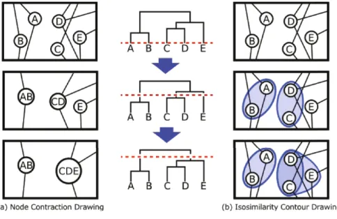
Nodes are clustered according to the degree of similarity, from 0%–100%. A threshold value t (0 ≤ t ≤ 100[%]) is given, and our method draws clusters when nodes have a higher similarity value than t.
The middle column in Fig. 2 shows a clustering structure in the form of a dendrogram. The elements at the bottom of the dendrogram are nodes, and all the branch points correspond to clusters. The dotted line crossing horizon- tally through the dendrogram represents the threshold value t. In our method, showing clusters with a higher similarity than t is synonymous with cutting the dendrogram horizontally and drawing only the node and the cluster connected to the edge of the cutting plane. Because the readers can change this t and see the resulting visualized graph, we achieve the effect of dynamic clustering. This way, we can obtain the most suitable graph visualization for each reader.
A slider is employed on the interface that changes threshold value t; its max- imum value is set to 100%, and the minimum is set to 0%. If the slider has a minimum value, only one cluster aggregating all nodes will be drawn.
An effective technique to show in detail the gaze point of clustered graphs involves displaying only the nodes that are focused on. One of the purposes of visualization is to obtain related information about the nodes that we pay attention to. In this case, the information about the nodes in the cluster is important. Also, it is possible to expand the cluster with the above-mentioned slider, but there is the possibility that unnecessary nodes may also be expanded.
Because of that, we implemented a function that expands one cluster that is appointed at one time, so that the appointed clusters are expanded one by one.
As a result, the logical structure of the nodes being focused on can be seen,
and the readers are assisted in their appropriate recognition.
5 Isosimilarity Contour Drawing
We wanted to develop a new method of improving readability that was different from dynamic modification of clustering level, and we came up with the idea of focusing on the reader’s viewpoint. This method involves drawing a closed curve surrounding highly related nodes using the cluster information, and its purpose is to improve graspability. We named this method “isosimilarity contour drawing.”
An effective way to show what humans fixate their eyes on is to indicate the important parts with a surrounding line. The formation of clusters can be recognized from the result even if clustering is not used. However, we aim to improve the recognition of the relations between nodes by actively displaying the result of clustering using a contour line.
The hierarchy clustering used in this research has a tree structure. It is possible to represent it using a nested structure. In an isosimilarity contour drawing, original nodes and edges are always drawn. If the dendrogram is cut horizontally, the clusters under the cut line are drawn. The cluster is represented as a closed curve that encloses all the included nodes.
The interface of this method also includes a slider, where we can interactively change the thereshold value to draw contours. When moving the slider in the negative direction, the number of contours increases until finally all nodes are surrounded by the biggest contours.
In this method, the contours are drawn as closed lines filled with a transparent blue color. By using a transparent color, overlapping of clusters can be repre- sented. The rate of transparency is proportional to the degree of similarity of clusters. The higher the degree of similarity is, the lower the rate of transparency will be. Clusters that have closely related nodes and many layers are drawn with a denser color.
6 Drawing Examples
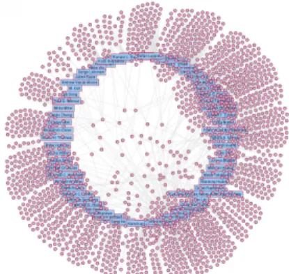
As an example, we visualized the network of coauthorships of papers obtained from DBLP
2(anchors(authors): 69, free nodes (papers): 1891, edges: 2222). Be- cause of the large number of nodes, when using a normal anchored map, it is difficult to understand the contents of the network (Fig. 1(b)).
The visualization results of the network using the node contraction drawing method are shown in Fig. 3(a),(c), and (e). When the node contraction drawing is activated and the slider is moved to 100%, the number of free nodes becomes about 150. The amount of free nodes having the same connections is very large, as papers tend to be written by the same group of coauthors. When the slider is moved to 50%, some papers remain in the center of the drawing area. These papers were written by an unusual group of coauthors, and we suppose that they connect several communities.
Fig. 3(d) and (f) shows the visualization result of the network using the isosim- ilarity contour drawing. The labels of free nodes have been omitted. The original
2