Heat Map with Hierarchical Clustering:
Multivariate Visualization Method for Corpus‑based Language Studies
著者(英) Yuichiro KOBAYASHI
journal or
publication title
NINJAL Research Papers
number 11
page range 25‑36
year 2016‑07
URL http://doi.org/10.15084/00000839
Heat Map with Hierarchical Clustering:
Multivariate Visualization Method for Corpus-based Language Studies
KOBAYASHI Yuichiro
Toyo University / Project Collaborator, NINJAL Abstract
An advantage of corpus-based language studies is that global descriptions of linguistic texts can be obtained by examining a broad range of linguistic features. However, multivariate statistical techniques are required to analyze the multiple linguistic features found in a number of texts.
This study compared the strengths and weaknesses of several multivariate statistical techniques, thereby demonstrating the effectiveness of using heat map with hierarchical clustering as a powerful method for visualizing multivariate data. Explanations are also provided for how these techniques can be used in the R programming language as well as indicating how the results obtained can be interpreted.*
Key words: multivariate visualization, corpus analysis, heat map, hierarchical clustering, R
1. Introduction
An advantage of corpus-based language studies is that global descriptions of linguistic texts can be obtained by examining a broad range of linguistic features. However, multivariate statistical techniques are required to analyze the multiple linguistic features found in a number of texts.
These techniques can identify the complex interrelationships among linguistic features and texts, as well as the associated patterns between linguistic features and texts. The appropriate- ness of these techniques for analyzing language has been confirmed in the past few decades. For example, Burrows (1987) employed principal components analysis to analyze the idiolects of the major characters in Jane Austen’s novels. Biber (1988) applied factor analysis to describe the linguistic characteristics of speech and writing. Nakamura and Sinclair (1995) used Hayashi’s Quantification Method Type III, a method that is mathematically identical to correspondence analysis, to compare the frequencies of the collocates of the word woman in four components of the Bank of English, a representative subset of the COBUILD Corpus. Moreover, Hoover (2003) used cluster analysis to distinguish texts written by different authors using commonly occurring words in these texts. In the present study, I compared the strengths and weaknesses of several multivariate statistical techniques, thereby demonstrating the effectiveness of using heat map with hierarchical clustering as a powerful method for visualizing multivariate data. I also explain how these techniques are used with R (Ihaka and Gentleman 1996) and how the results can be interpreted.
* This study was supported by funds from two NINJAL collaborative research projects, “Study of the his- tory of the Japanese language using statistics and machine-learning” (PI: Toshinobu Ogiso, 2010–2013) and
“Design of a diachronic corpus” (PI: Makiro Tanaka, 2012–2016). An earlier version of this study was re- ported at the research group meeting held at the National Institute for Japanese Language and Linguistics on April 18, 2015. The author thanks the members of these research projects for their useful feedback.
2. Multivariate visualization methods
Visualization is useful for identifying meaningful patterns in multivariate data comprising a large number of samples (e.g., texts and corpora) and variables (e.g., letters, words, and grammati- cal features). It also provides an intuitive understanding of the significant associations among samples and variables.
2.1 Correspondence analysis
One of the most common ways of visualizing multivariate data is using a scatter plot. Scatter plots can be utilized to visualize the results of factor analysis, principal components analysis, cor- respondence analysis, and multidimensional scaling (Baayen 2008). In particular, correspondence analysis is most popular in the fields of stylometry and corpus linguistics (e.g., Linmans 1998, Nakamura 1993, Tabata 2002, Wilson 2005). Correspondence analysis is an exploratory tech- nique for mathematically summarizing the relationships between samples and variables, which graphically represents them in a two- or three-dimensional scatter plot (Glynn 2014).
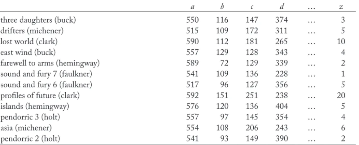
Several packages are available for conducting correspondence analysis in R (e.g., ade4, amap, anacor, ca, FactoMineR, homals, pamctdp, and vegan). In this study, I selected the ca package (Nenadic and Greenacre 2007) because the author dataset containing the counts for the 26 letters of the alphabet in 12 different text samples is included as a sample data- set in this package. The letter counts do not include proper nouns.
Table 1: Part of the author dataset in the ca package
a b c d … z
three daughters (buck) 550 116 147 374 … 3
drifters (michener) 515 109 172 311 … 5
lost world (clark) 590 112 181 265 … 10
east wind (buck) 557 129 128 343 … 4
farewell to arms (hemingway) 589 72 129 339 … 2
sound and fury 7 (faulkner) 541 109 136 228 … 1
sound and fury 6 (faulkner) 517 96 127 356 … 5
profiles of future (clark) 592 151 251 238 … 20
islands (hemingway) 576 120 136 404 … 5
pendorric 3 (holt) 557 97 145 354 … 4
asia (michener) 554 108 206 243 … 6
pendorric 2 (holt) 541 93 149 390 … 2
The R script used to perform correspondence analysis for this dataset is as follows.
> # Installing the package
> install.packages(“ca”, dependencies = TRUE)
> # Loading the package
> library(ca)
> # Performing correspondence analysis
> ca.res <- ca(author)
> plot(ca.res)
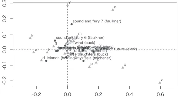
Figure 1 shows the scatter plot obtained by running the correspondence analysis. The coor- dinates in the figure reflect the interrelationships between 12 text samples, the relative proximity between the 26 letters of the alphabet, and the association patterns between text samples and letters.
Figure 1: Correspondence analysis (samples and variables)
Figure 1 graphically illustrates both the samples and variables in two-dimensional space.
Therefore, it is difficult to verify the relationships between them in cases where many samples and variables are plotted in the scatter plot. An alternative option is to display only the samples or variables in the plot to facilitate their readability.
> # Plotting only text samples
> plot(ca.res, what = c(“all”, “none”))
Figure 2 shows the similarities among 12 text samples written by six novelists. Each pair of samples by the same author has been plotted relatively close to each other. For example, both Lost World (Clark) and Profiles of Future (Clark) are distributed on the right-hand side of the figure, while Asia (Michener) and Drifters (Michener) are positioned at the bottom of the plot. These pairs have similar frequency patterns for the 26 letters of the alphabet.
Scatter plots are helpful for grouping the samples and/or variables in a dataset. However, they are sometimes interpreted in an arbitrary manner, i.e., in “an informal way, grouping ‘by eye’ the points lying one near the other on the plot,” and thus “a more formal method” would be useful to better understand these plots (Alberti 2013: 40).
2.2 Cluster analysis
Cluster analysis is a method for organizing information regarding the similarity of items (i.e., samples or variables) so groups (or “clusters”) can be formed (Divjak and Fieller 2014). This method provides tree-like categorizations, where small groups of highly similar items are included within much larger groups of less similar items (Oakes 1998). This technique has been utilized in a wide variety of language studies including authorship attribution (Hoover 2003), lexical semantics (Gries 2012), and phonetic variation (Wieling, Shackleton Jr., and Nerbonne 2013).
Cluster analysis can be conducted with the dist and hclust functions. The dist func- tion calculates a distance matrix and the hclust function then performs hierarchical clustering based on the distance matrix. The Euclidean distance measure and complete linkage method (Divjak and Fieller 2014) are selected for these functions, respectively, according to the default settings.
Figure 2: Correspondence analysis (samples)
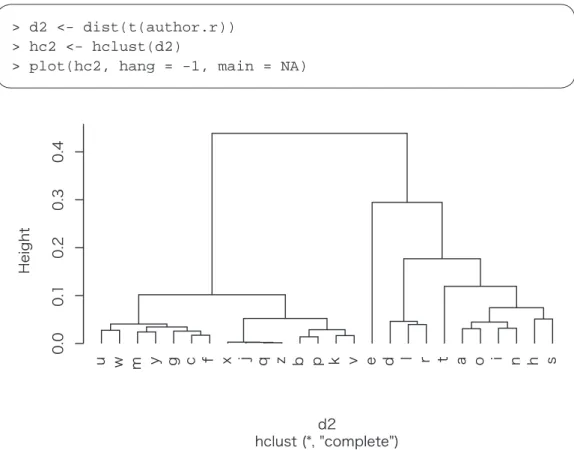
Figure 3 shows a dendrogram representing the results of cluster analysis, where each pair of text samples by the same author is highly similar in terms of the frequencies of the 26 letters.
These results also suggest that there is a gap in the frequency patterns between three novelists on the left-hand side (i.e., Holt, Buck, and Hemingway) and three on the right (i.e., Faulkner, Michener, and Clark).
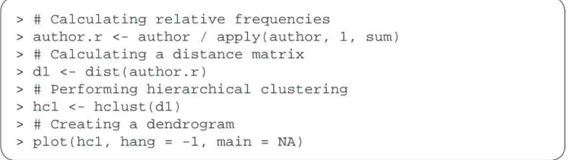
> # Calculating relative frequencies
> author.r <- author / apply(author, 1, sum)
> # Calculating a distance matrix
> d1 <- dist(author.r)
> # Performing hierarchical clustering
> hc1 <- hclust(d1)
> # Creating a dendrogram
> plot(hc1, hang = -1, main = NA)
Figure 3: Cluster analysis (samples)
The 26 letters can be grouped by transposing the frequency table used for cluster analysis.
> d2 <- dist(t(author.r))
> hc2 <- hclust(d2)
> plot(hc2, hang = -1, main = NA)
Figure 4: Cluster analysis (variables)
More sophisticated clustering methods are available using R packages such as amap, ape, cluster, FactoMineR, fpc, mclust, pvclust, and tclust. Various types of distance measures are also available in the proxy package. Different distance measures or clustering methods can yield different clustering results, so it is necessary to carefully compare several combinations. The robustness of the clustering results obtained can be assessed by examining the widths of the silhouettes using the silhouette function in the cluster package and by computing the p-value for each cluster in a dendrogram after multiscale bootstrap resampling using the pvclust function in the pvclust package (Divjak and Fieller 2014). Moreover, multiple trees created with different measures and methods can be statistically integrated into a single consensus tree using the consensus function in the ape package (Baayen 2008).
The graphical representations of cluster analyses are easier to interpret than those obtained by correspondence analysis in terms of the grouping of items (Glynn 2014). However, cluster analy- sis does not provide information about the associations between samples and variables because the samples and variables cannot be visualized simultaneously in a single dendrogram.
2.3 Heat map
A heat map is a method for visualizing multivariate data where the individual values contained in
a frequency matrix are represented as colors. Heat maps are used widely in the natural sciences, especially in the biological sciences (Wilkinson and Friendly 2009), and they can be applied to language studies such as diachronic corpus analysis (Kehoe and Gee 2009) and stylometric analysis (Saccenti and Tenori 2012).
A very simple heat map can be made using the image function, but more sophisticated heat maps can be produced with the ggplot2 and reshape2 packages.
> # Installing the packages
> install.packages(c(“ggplot2”, “reshape2”))
> # Loading the packages
> library(ggplot2)
> library(reshape2)
> # Creating a heat map
> author.m <- melt(author.r)
> ggplot(author.m, aes(Var2, Var1)) + geom_tile(aes(fill = value), colour = “white”) + scale_fill_gradient(low = “white”, high = “black”)
Figure 5: Heat map
Figure 5 shows a heat map generated based on the frequencies of the 26 letters occurring in 12 text samples. This diagram compares the samples where more frequent letters are represented by darker cells and less frequent letters are denoted by lighter cells. The frequency distributions of the 26 letters are quite similar in all of the samples, and a, e, h, i, n, o, r, s, and t are more common than other letters. However, y is more frequent in Faulkner’s “sound and fury 7” than the other samples, and c is more common in the four samples written by Clark and Michener.
The visual representation of the heat map is based directly on the original frequency table.
Therefore, it is highly intelligible, especially in cases where the tables contain small numbers of samples and variables. However, heat maps are not necessarily effective at interpreting larger frequency tables because, unlike correspondence analysis and cluster analysis, any information included in them is not statistically summarized.
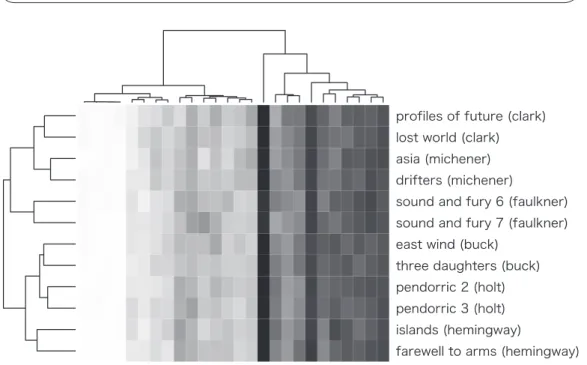
3. Heat maps with hierarchical clustering
Each of the multivariate visualization methods compared in the previous sections has various advantages and disadvantages. However, a combination of multiple methods can perform better than any single method in terms of the visualization and interpretation of a frequency table. The best combination is cluster analysis with a heat map, which is known as heat map with hierarchi- cal clustering. This method can be used to display the results obtained from clustering samples and variables, while simultaneously generating a heat map from the permutated frequency table in two-dimensional space. Using heat map with hierarchical clustering, Chaussabel (2004) exam- ined the relationships among 239 categories and 517 keywords in biomedical research articles.
Kobayashi (2014) also investigated the frequency patterns of 42 types of lexical and grammatical errors in seven different stages in English-language acquisition using the same visualization method.
Heat maps with hierarchical clustering can be created with the heatmap function.
> # Creating a heat map with hierarchical clustering
> heatmap(as.matrix(author.r), scale = “none”, col =
colorRampPalette(c(“white”, “black”))(256), margin = c(4,0))
Figure 6: Heat map with hierarchical clustering
The two dendrograms in Figure 6 show exactly the same clustering results as those in Figures 3 and 4, but they are different in appearance due to the different algorithms used to visualize the tree. The rows and columns in the heat map are permutated according to the clustering results obtained for the samples and variables. By combining these three diagrams, this visualization method overcomes the disadvantages of correspondence analysis, cluster analysis, and heat maps discussed in the previous sections. The figure shows the interactions between samples and variables by combining the two dendrograms, thereby providing a more intelligible graphical representation compared with correspondence analysis in terms of the groupings of samples and variables. Furthermore, the arbitrary interpretation and misreading of results can be avoided by referring to the heat map, which represents the frequency distributions and co-occurrence pat- terns of each sample and variable included in the original frequency table.
Heat maps with hierarchical clustering can also be generated with the d3heatmap, dendextend, fheatmap, gapmap, GMD, gplots, heatmap.plus, heatmap3, Heatplus, made4, NMF, and pheatmap packages. The relative frequencies can be placed within each cell using the heatmap.2 function in the gplots package.
> # Installing the package
> install.packages(“gplots”)
> # Loading the package
> library(gplots)
> # Creating a heat map with hierarchical clustering and rel- ative frequencies
> heatmap.2(as.matrix(author.r), col = colorRampPalette(c(
“#ffffff”, “#7f878f”))(256), cellnote = round(author.r, 2), notecol = “black”, notecex = 0.5, density.info = “none”, trace = “none”, margin = c(2, 12), cexRow = 0.7, cexCol = 0.7, key = FALSE)
The implementation of the script given above is shown in Figure 7. The clustering results can be interpreted better by examining the relative frequencies and cell colors in the heat map. Furthermore, a close investigation of specific frequency patterns can be implemented in combination with statistical hypothesis testing and effect sizes (Gries 2014). For instance, the significance of inter-cluster differences can be determined by conducting analysis of variance (ANOVA) using the aov and anova functions, or by implementing the Kruskal-Wallis rank sum test using the kruskal.test function. Quantitative research approaches are more reli- able than qualitative approaches in terms of replicability, provided that an identical conclusion can be obtained using different analytical methods.
Figure 7: Heat map with hierarchical clustering and relative frequencies
4. Conclusion
Heat map with hierarchical clustering is a powerful method for visualizing multivariate data, such as large frequency tables for linguistic analysis, where the graphical representation obtained provides a statistical summary of complex frequency patterns, as well as the original frequency information contained in the data. Therefore, the underlying meaningful patterns between samples and variables can be detected easily in multiple dendrograms. Moreover, the interpreta- tion of these patterns can be validated by referring to the heat map. This multivariate statistical method will become increasingly important as the size of corpora increases and as corpus-based language studies cover a broader range of linguistic features.
References
Alberti, Gianmarco (2013) An R script to facilitate correspondence analysis: A guide to the use and the interpretation of results from an archaeological perspective. Archeologia e Calcolatori 24: 25–53.
Baayen, R. Harald (2008) Analyzing linguistic data: A practical introduction to statistics using R. Cambridge:
Cambridge University Press.
Biber, Douglas (1988) Variation across speech and writing. Cambridge: Cambridge University Press.
Burrows, John F. (1987) Computation into criticism: A study of Jane Austen’s novels and an experiment in method. Oxford: Clarendon Press.
Chaussabel, Damien (2004) Biomedical literature mining: Challenges and solutions in the ‘omics’ era.
American Journal of Pharmacogenomics 4(6): 383–393.
Divjak, Dagmar, and Nick Fieller (2014) Cluster analysis: Finding structure in linguistic data. In: Dylan Glynn and Justyna A. Robinson (eds.), 405–441.
Glynn, Dylan (2014) Correspondence analysis: An exploratory technique for identifying usage patterns. In:
Dylan Glynn and Justyna A. Robinson (eds.), 443–485.
Glynn, Dylan, and Justyna A. Robinson (eds.) (2014) Corpus methods in cognitive semantics: Quantitative studies in polysemy and synonymy. Amsterdam: John Benjamins.
Gries, Stefan Th. (2012) Behavioral profiles: A fine-grained and quantitative approach in corpus-based lexi- cal semantics. In: Gary Jarema, Gonia Libben, and Chris Westbury (eds.) Methodological and analytic frontiers in lexical research, 57–80. Amsterdam: John Benjamins.
Gries, Stefan Th. (2014) Frequency tables: Tests, effect sizes, and explorations. In: Dylan Glynn and Justyna A. Robinson (eds.), 365–389.
Hoover, David L. (2003) Statistical stylistics and authorship attribution: An empirical investigation. Liter- ary and Linguistic Computing 16(4): 421–444.
Ihaka, Ross, and Robert Gentleman (1996) R: A language for data analysis and graphics. Journal of Compu- tational and Graphical Statistics 5(3): 299–314.
Kehoe, Andrew, and Matt Gee (2009) Weaving web data into diachronic corpus patchwork. In: Antoinette Renouf and Andrew Kehoe (eds.) Corpus linguistics: Refinements and reassessment, 255–279. Amsterdam:
Rodopi.
Kobayashi, Yuichiro (2014) Computer-aided error analysis of L2 spoken English: A data mining approach.
Proceedings of the Conference on Language and Technology 2014, 127–134.
Linmans, A. J. M. (1998) Correspondence analysis of the synoptic gospel. Literary and Linguistic Computing 13(1): 1–13.
Nakamura, Junsaku (1993) Quantitative comparison of modals in the Brown and the LOB corpora.
ICAME Journal 17: 29–48.
Nakamura, Junsaku, and John Sinclair (1995) The world of woman in the Bank of English: Internal criteria for the classification of corpora. Literary and Linguistic Computing 10(2): 99–110.
Nenadic, Oleg, and Michael Greenacre (2007) Correspondence analysis in R, with two- and three-dimen- sional graphics: The ca package. Journal of Statistical Software 20: 1–13.
Oakes, Michael P. (1998) Statistics for corpus linguistics. Edinburgh: Edinburgh University Press.
Saccenti, Edoardo, and Leonardo Tenori (2012) Stylometric investigation of Dante’s Divina Comedia
by means of multivariate data analysis techniques. International Journal of Computational Linguistics Research 3(2): 35–48.
Tabata, Tomoji (2002) Investigating stylistic variation in Dickens through correspondence analysis of word- class distribution. In: Toshio Saito, Junsaku Nakamura, and Shunji Yamazaki (eds.) English corpus lin- guistics in Japan, 165–182. Amsterdam: Rodopi.
Wieling, Martijn, Robert G. Shackleton Jr., and John Nerbonne (2013) Analyzing phonetic variation in the traditional English dialects: Simultaneously clustering dialects and phonetic features. Literary and Linguistic Computing 28(1): 31–41.
Wilkinson, Leland, and Michael Friendly (2009) The history of the cluster heat map. The American Statisti- cian 63(2): 179–184.
Wilson, Andrew (2005) Modal verbs in written Indian English: A quantitative and comparative analysis of the Kolhapur corpus using correspondence analysis. ICAME Journal 29: 151–170.
ヒートマップと階層型クラスタリング
――コーパスに基づく言語研究のための多変量視覚化手法――
小林雄一郎
東洋大学/国立国語研究所共同研究員 要旨
コーパスに基づく言語研究の利点は,広範な言語項目を分析対象とすることで,言語データを 包括的に記述できることである。しかしながら,複数のデータにおける多数の言語項目を効率的 に分析するためには,多変量解析などの統計手法に関する知識が求められる。本稿では,言語研 究で活用することができる複数の多変量解析の長所と短所を比較検討し,ヒートマップと階層型 クラスター分析を組み合わせて用いることの有効性を論じる。それに加えて,R言語を用いた解 析方法と,その解析結果を解釈する方法を提示する。
キーワード:多変量データの視覚化,コーパス分析,ヒートマップ,階層型クラスタリング,
R言語