DOI: http://doi.org/10.14947/psychono.36.2
Color illusion on complexion by lipsticks and its impression
1Yoshie Kiritani
a,*, Akane Okazaki
b, Kanako Motoyoshi
c,
Ruriko Takano
dand Noriko Ookubo
daChiba University, bAppirits Inc.,
cTHE PACK CORPORATION,
dSHISEIDO CO., LTD.
Point makeup perceptually affects overall facial color; for example, it takes on the tinge of the eye shadow color. This study preliminarily confirmed the assimilation effect by lipstick colors and the relationship between perceptual and esthetic measures. Four typical lipstick colors, red, pink, orange, and violet, were utilized. An averaged face var-ied based on two factors, lightness (lighter and darker) and hue (reddish and yellowish), was examined. Twenty-four females assessed the faces in terms of perceptual hue (redness for the reddish faces and yellowness for the yellowish faces), perceptual lightness, dullness, and looking-goodness via paired comparisons. Consequently, an assimilation effect of lipstick’s hue on perceptual complexion was confirmed. However, a perceptual change in lightness could not be explained by assimilation or contrast; the redness of lipsticks enhanced the perceptual lightness of complex-ion. Dullness negatively correlated not only with perceptual lightness but also with perceptual redness of faces and physical redness of lipsticks. Looking-goodness clearly correlated with perceptual redness of faces and each lipstick color had its own effect.
Keywords: color illusion, complexion, makeup, lipstick, impression Women usually apply makeup to create a desirable
appear-ance, because faces convey much information about the corre-sponding persons. This study investigated the perceptual change in facial color resulting from using makeup. More spe-cifically, it examined color illusions and practical aesthetic ef-fects on faces.
It is clear that makeup can change facial colors. Usually, in practice, people are told to use makeup similar in color to their complexion. It is said that when opposite colors are used, the face’s hue is emphasized, causing the face to look unat-tractive. However, some professional makeup artists use oppo-site colors for the skin. The use of these two methods in Japan was summarized by Kiritani, Komuro, Okazaki, Takano, & Ookubo (2016).
In the first place, which color is the most desirable
complex-ion? Studies have presented different results regarding pre-ferred face colors. One point of disagreement is “yellowish or reddish,” which is also a dimension of the foundation color ochre-pink. Using portraits of Caucasian females, Suzuki (1990) showed that Japanese preferred a more reddish face color than that preferred by Caucasians. Aoki, Suzuki, & Ko-bayashi (2003) indicated that the preferred flesh color is based on memory color and revealed that female faces are remem-bered as redder and less yellower than male faces and that fe-male participants 30 years old and older particularly preferred less yellowish face colors. Yoshikawa et al. (2009) investigated application of foundation to female faces and found that the preferred foundation color was lighter and redder than the suited color evaluated by professional evaluators. Conversely, Using printed photographs, Shibaki, Hirakawa, Furukawa, & Naito (2005) showed that the acceptable range of redness as skin color is smaller than that of yellowness. Using a female portrait, Fan, Deng, Tsuruoka, Aoki, & Kobayashi (2010) showed that the face color selected by Japanese as excellent is yellower and less red than that selected by Chinese. Although detailed information about the stimuli is unknown, Miura & Saito (2003) showed that the yellow skin color of the standard Copyright 2017. The Japanese Psychonomic Society. All rights reserved. 1 This work was supported by JSPS KAKENHI grant
Number 15K00678. An earlier version of this paper was presented at ECVP 2016.
* Corresponding author. Department of Design, Graduate School of Engineering, Chiba University, 1–33 Yayoicho, Inage-ku, Chiba 263–8522, Japan.
E-mail: [email protected] J-STAGE First published online: July 20, 2017
Japanese skin is widely preferred and that reddish, possibly dark, skin color is not preferred but is seen as healthy. These previous studies are predominantly about Japanese preferred complexion.
In addition to preference, the redness and the yellowness of skin are important factors in the evaluation of complexion. Stephen, Smith, Stirrat, & Perrett (2009) stated that increased redness, yellowness, and lightness of skin signified an en-hanced healthy appearance, as the redness corresponds to blood coloration and the yellowness and the lightness are as-sociated with carotenoid pigmentation. Perrett et al. (2016) showed that skin yellowness increases with fitness and de-creases with body fat to correspond to an increase or decrease in carotenoids. In addition, Changizi, Zhang, & Shimojo (2006) presented evidence for a biological complexion judg-ment mechanism comprising two blood-related color dimen-sion: (1) A green-red bipolar structure corresponding to the degree of oxygen saturation, and (2) a yellow-blue structure corresponding to the amount of blood. Because healthy skin has sufficient blood with sufficient oxygen, a healthy face is in-variably tinged with redder and bluer colors. A discussion on the association of the physiological counterparts of perceived skin colors with skin color preference would be interesting.
Suzuki (2005) and Kobayashi (2007) indicated that the pre-ferred skin color is actually memory color and varies accord-ing to several factors such as the race of evaluators, their ages, season, scene, nationality, and gender of models. Nogami & Ishiguro (2016) showed that coincidence of colors among cheek, face line, and neck determine the score of beauty and that lightness of face is not very important when it is above a certain level. Sakai, Suzuki, Sato, & Matsuda (2003) investigat-ed the question of whether people can evaluate the face color that looks good on models. Their results indicated that non-professional persons could distinguish colors that look good on models in a yellow-blue dimension, although with these in-expert evaluators, it was easy to select bad colors. Point make-up products are usually described in a yellow-blue dimension that corresponds to an ochre-pink foundation dimension.
Apparent color of face can also be changed by point make-up. Kiritani et al. (2016) preliminarily confirmed an eye shad-ow assimilation effect. In their study, sixteen female students compared the colors of faces and ellipses to evaluate the red-ness and yellowred-ness of the faces. The results showed that some reddish eye shadow colors (e.g., red, pink, purple) enhanced the redness of both reddish and yellowish faces during serial
presentation of faces and ellipses. Using a paired comparison method, Kiritani, Komuro, Okazaki, Takano, & Ookubo (2015a, 2015b) also showed that (a) reddish face is perceived as redder when it has pinkish and purplish eye shadows or reddish saturated eye shadow instead of containing yellowish components; (b) yellowish face becomes anti-yellower with eye shadows that have no greenish or yellowish component; and (c) all eye shadows except for the yellowish ones make the face look darker. Even a small area such as eyelids can percep-tually change the overall face complexion. This may be a fact that many women experience daily when they apply makeup themselves.
The perceptual change in complexion by eye shadows is a color assimilation effect that results in a perceptual illusion. This can be regarded as a form of biological illusion (Morika-wa, 2012, 2017). These illusions are related to the shape and size of the human face and body. One of their characteristic features is the effect of illusion magnitude. Such illusions tend to peak at 4–6%. Even an illusion magnitude of 5% can result in significant changes in impressions. The “visual echo illu-sion” (biological illusion) has similarities to color assimilation; it specifically refers to the figural configurations that induce perceptual assimilation in the human face and body. Accord-ing to Morikawa (2012), physically small changes can generate illusions in the human face, which tend to be assimilation ef-fects.
Thus, the results presented by Kiritani et al. (2015a, 2015b, 2016) are examples of perceptual hue change in assimilation by eye shadows. Futagawa, Hirayama, & Yamazaki (2009) also showed how the brightness of the décolleté could result in as-similation effects on the face; a brighter décolleté causes the face to appear similarly bright. This is an assimilation of light-ness in faces.
The present study focused on the color of lipstick as point makeups. As mentioned above, eye shadows can induce an as-similation effect on complexion. If the effect of point makeup is a visual echo illusion, lipsticks can also evoke an assimila-tion effect. In related research, Kobayashi, Matsushita, & Mor-ikawa (in press) revealed that darker lips make faces look darker and that red lips make faces perceptually lighter; the ef-fect of darker lips was assimilation but that of red lips cannot be considered as assimilation or contrast. We cannot deny the possibility of contrast, because the configuration of a face might be similar to the pattern of contrast in which a small figure is surrounded by a large figure; in the face, the mouth,
to which the lipstick is applied, is the small part and is seen as surrounded by skin. The relationship between the inducing area and the induced area in the patterns of contrast is re-versed in the face, because attention is now paid to the small part, lip in face, which should be an induced area in the usual figural pattern. However, the overall configuration as a figure is similar to the pattern of contrast; it might affect the percep-tion of complexion. Further, in daily life, women state that highly colored lipsticks can make the face look lighter. This study confirmed whether the perceptual change of complexion by lipsticks is assimilation or contrast.
If the effect of lipstick is considered, not only the perceptual color but also other evaluation measures should be examined. Stephen & McKeegan (2010) studied the effect of lip color on sex typicality and attractiveness, presenting Caucasian samples to Caucasian participants that manipulated the color of the lips. To enhance the femininity and attractiveness of female faces, the participants increased the redness contrast between lip and skin. Conversely, they reduced the redness contrast to enhance the masculinity of male faces. Blueness contrast was reduced in female more than in male for sex typicality and at-tractiveness. Lightness contrast enhanced the attractiveness of both male and female faces. These results were considered in relation to biological facts, such as estrogen level and blood oxygenation, and further discussed in terms of the relation be-tween facial appearance and health. The researchers empha-sized the importance of lip redness for female faces as regards femininity and attractiveness. As mentioned above, the specif-ic effect of red lips on perceived lightness of the face was con-firmed by Kobayashi et al. (in press), who also indicated the possibility of healthy impression affecting perceived lightness.
The present study investigated the effects of lipstick colors on the perception and evaluation of complexion. We exam-ined whether, like eye shadows, lipstick colors induced color assimilation and also measured two esthetic aspects of facial skin. The stimuli used in this study did not cover all lipstick and face colors, however, the results can be considered a springboard for further discussion of the visual echo illusion and the relation between perceptual measures and esthetic evaluation measures.
Experiment
Method
Participants. Twenty-three female students (mean age= 22.4 years, SD=1.97) participated in the experiment. They
had normal vision and applied their own makeup daily. Al-though no tests of color vision anomalies were used, the ex-perimenters verbally confirmed that they had no color blind-ness. Informed consent was verbally obtained from each participant before participation in the study.
Apparatus and stimuli. The stimuli were presented on a 15-inch MacBook Pro with a Retina display (early 2013 mod-el) using Adobe Flash. The distance between the participant and monitor was about 50 cm. The background for the stimuli was gray with 75% opacity (a*=−5.25, b*=−2.77, relative L*=39.42, 10.90 cd/m2; we calculated all indexes of L* with reference to the monitor’s white value).
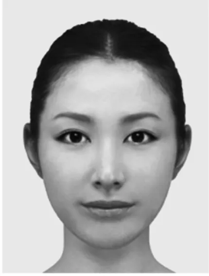
A picture (size: 135 mm×90 mm or 15.38°×10.29°) of an averaged female face obtained from Shiseido Co. Ltd. (Figure 1) formed the base stimulus. We used three experimental stimulus factors: face hue, face lightness, and lipstick color. In the experiment, faces with and without lipstick were evaluat-ed.
The face hue factor had two levels: reddish and yellowish. The face lightness factor also had two levels: lighter and dark-er. We set these factors and levels to get typical Japanese wom-en face colors. Discrimination betwewom-en yellowish face and red-dish face is important, as mentioned in the introduction. Difference in the lightness of faces has also become a major topic. As this was a preliminary study and adopted a paired comparison method, we prepared a few rather extreme colors to get definite results. However, all of the face colors were es-tablished under advice from professional makeup artists in
der not to become unnatural. To get colorimetric data, nine points were measured on each cheek; the averages of the in-dexes are presented in Table 1.
The lipstick color factor had four levels (Table 2): red, pink, orange, and violet. A lip without lipstick was also prepared. On the lips, three points were measured and averaged. All col-ors were measured using a spectroradiometer (CS-2000, Koni-ca Minolta with CSS-10W software). As Table 2 shows, the same lipstick colors had different colorimetric data according to the face color; for example, the color of red lip was physical-ly lighter in the lighter reddish face than in the darker reddish face. The reason for this was to maintain the apparent natural-ness of the makeup. If the physically same color was put on the lip regardless of the lightness of the face, the lip would be out of its element. Furthermore, in daily life, even when the physi-cally same color lipstick is applied, the colors become different
according to the original colors of the lip. In this study, the names of lipstick colors were perceptual labels and did not in-dicate the physical colorimetric data.
The lipsticks were applied using Adobe Photoshop CS6. A semi-transparent colored figure was placed on each lip. The opacities were different among the colors: 25% for the red lip-stick, 30% for the pink, 33% for the orange, 25% for the vio-let, and 33% for no lipstick. White lines as gloss expression were added to the upper side of the upper lip, and the upper side and right-lower side of the lower lip. These white lines had a lightness of 80% in the software. The lipstick colors used are typical in the market and were adjusted based on sug-gestions by makeup professionals. The lip without lipstick was not a nude lip of the averaged face, because it was rather red and did not seem nude. Therefore, we placed a skin color fig-ure on the lip to express apparent nudeness.
Table 1. Indexes of four face colors.
Face h C* a* b* Relative L* Luminance (cd/m2)
Light reddish 33.92 24.44 13.64 20.28 84.23 207.07
Light yellowish 12.79 26.81 5.94 26.15 86.29 220.94
Dark reddish 37.90 41.57 25.54 32.80 72.68 140.05
Dark yellowish 21.00 43.45 15.57 40.57 75.69 155.87
Table 2.
Indexes of five lip colors in each face.
Face Lipstick h C* a* b* Relative L* Luminance (cd/m2)
Light reddish None 70.17 28.39 26.71 9.63 67.13 113.64
Red 71.23 55.41 52.47 17.83 62.72 95.31
Pink 84.47 51.61 51.37 4.97 66.66 111.68
Orange 46.11 56.11 40.44 38.90 68.12 118.10
Violet 295.18 46.95 42.49 −19.97 62.63 94.98
Light yellowish None 42.93 20.35 13.86 14.90 69.80 126.16
Red 65.65 54.45 49.60 22.45 63.73 99.35
Pink 79.52 48.98 48.16 8.91 67.98 117.46
Orange 41.95 57.20 38.24 42.54 68.90 121.62
Violet 289.36 42.89 40.47 −14.22 62.37 94.00
Dark reddish None 68.82 37.94 35.38 13.71 57.38 75.88
Red 68.45 65.87 61.26 24.20 56.20 71.95
Pink 80.01 60.82 59.91 10.49 60.36 86.33
Orange 48.19 67.19 50.08 44.79 61.40 90.21
Violet 285.76 53.93 51.90 −14.65 55.21 68.78
Dark yellowish None 50.18 35.46 27.24 22.71 59.47 83.12
Red 60.17 71.14 61.72 35.39 55.17 68.75
Pink 73.07 61.43 58.76 17.89 60.20 85.84
Orange 42.93 71.72 48.85 52.51 61.71 91.38
Procedure. The evaluated endpoints were the redness or yellowness of the faces, their lightness, their dullness, and looking-goodness. Paired comparison was adopted for the evaluation. Specifically, two faces with the same base color were simultaneously shown on the monitor. For the perceptual hue, participants were required to evaluate the redness and yellowness of presented reddish and yellowish faces, respec-tively. The participants were then to select the redder face from the pair of reddish faces or the yellower face from the pair of yellowish faces. Similarly, participants were asked to se-lect the lighter face for the evaluation of lightness, the duller face for the evaluation of dullness, and the looking-better face for the evaluation of looking-goodness. The participants were required to look at and evaluate the entire face, not certain parts in the face, although we did not do any eye-tracking test.
As there were four face base colors, lighter reddish, lighter yellowish, darker reddish, and darker yellowish, and four mea-sures, the participants experienced paired comparisons in 16 blocks of trials. In each paired comparison, the 20 pairs of face stimuli were randomly presented. Two out of five lip color stimuli made 20 combinations and each combination was pre-sented twice because of replacement of right-and-left position. The presentation order of the stimuli was randomized both within and between participants. All of the participants fin-ished the experiment within 30 minutes. The experiment was performed in a dark room, where the only light source was the computer used in the experiment.
Results
All the redness, yellowness, and lightness data were scaled according to Scheffé’s (1952) method (Ura version) (Sato, 1985; Ura, 1959). To adopt this analysis, we gave a score of “+1” if one stimulus was preferred to another and “−1” otherwise.
Results of perceptual redness. Figure 2(a) shows the per-ceived redness of the lighter reddish faces, in which positively
higher values signify perceptually redder. An ANOVA showed that the main effect of lipstick colors was significant (F(4, 480)= 125.81, p=0.000, ηG2=0.361). Confidence intervals (CI) of the difference between the face without lipstick and the faces with lipsticks were calculated, using a yardstick’s Y; if the CI did not include zero, the difference between the scale values was significant at a certain significance level. The red (0.533), the pink (0.225), and the orange (0.108) lipsticks made the face look significantly redder (99% CI, ±0.174) than the face without lipstick (−0.417). There was no significant difference between the face without lipstick and the face with violet lip-stick (−0.450). None of the liplip-sticks made the face appear less red.
Figure 2(b) shows the perceived redness of the darker red-dish faces, in which positively higher values signify perceptu-ally redder. An ANOVA showed that the main effect of lipstick colors was significant (F(4, 480)=207.07, p=0.000, ηG2= 0.431). As was the case with the lighter red faces, from a yard-stick’s Y, the difference between the face without lipstick and the faces with the red (0.608), the pink (0.208), and the orange (0.117) lipsticks were significant (99% CI, ±0.194); these lip-sticks made the face look redder. There was no significant dif-ference between the face without lipstick (−0.475) and the face with violet lipstick (−0.458). None of the lipsticks made the face look less red.
Thus, the red, the pink, and the orange lipsticks perceptual-ly made the reddish faces redder both in the lighter and the darker faces.
Results of perceptual yellowness. Figure 3(a) represents the perceived yellowness of the lighter yellowish faces, in which positively higher values signify perceptually yellower and neg-atively higher values signify anti-yellower. The value of the red lipstick and that of the pink were similar, such that the former is below the line in Figure 3(a). An ANOVA showed that the main effect of lipstick colors was significant (F(4, 480)=
104.43, p=0.000, ηG2=0.218). From a yardstick’s Y, the differ-ence between the face without lipstick (0.017) and the faces with all other lipsticks was significant (99% CI, ±0.190). The or-ange lipstick (0.567) made the lighter yellowish face look sig-nificantly yellower but the violet (−0.208), the red (−0.192), and the pink (−0.183) lipsticks made the face significantly look anti-yellower.
Figure 3(b) shows the perceived yellowness of the darker yellowish faces, in which positively higher values signify per-ceptually yellower. An ANOVA showed that the main effect of lipstick colors was significant (F(4, 480)=64.00, p=0.000, ηG2= 0.133). From a yardstick’s Y, the difference between the face without lipstick (−0.158) and the faces with the orange lipstick (0.442) was significant (99% CI, ±0.215). The orange lipstick made the darker yellowish face look significantly yellower. The differences between the face without lipstick and other lip-sticks were not significant.
As for the perceptual yellowness, the orange lipstick made the yellowish face look yellower but the anti-yellowing effect by lipsticks appeared differently according to the lightness of the face. With lighter faces, the violet, the red, and the pink lipsticks made yellowish faces look anti-yellower. However, with darker face, none of the lipsticks made the faces look an-ti-yellower.
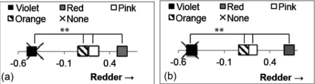
Results of perceptual lightness. Figure 4(a) shows the perceived lightness of the lighter reddish faces, in which posi-tively higher values signify perceptually lighter. An ANOVA showed that the main effect of lipstick colors was significant (F(4, 480)=85.83, p=0.000, ηG2=0.179). From a yardstick’s Y, the difference between the face without lipstick (−0.350) and the faces with the pink (0.350) and with the red (0.258) lip-sticks was significant (99% CI, ±.196). The pink and the red lipsticks made the lighter reddish faces look significantly light-er. The difference between the face without lipstick and the faces with the orange (−0.05) or with the violet (−0.208) was
not significant.
Figure 4(b) shows the perceived lightness of the darker red-dish faces, in which positively higher values signify perceptu-ally lighter. The value of the red lipstick was the same as that of the orange, such that the former is below the line in Figure 4(b). An ANOVA showed that the main effect of lipstick col-ors was significant (F(4, 480)=40.23, p=0.000, ηG2=0.083). From a yardstick’s Y, the face without lipstick (−0.217) had a significantly different value from the faces with lipsticks, ex-cept for the violet lipstick (99% CI, ±0.208). The pink (0.283), the red (0.058), and the orange (0.058) lipsticks made the darker reddish face look significantly lighter. The violet lipstick (−0.183) did not make the face look lighter.
Figure 4(c) shows the perceived lightness of the lighter yel-lowish faces, in which positively higher values signify percep-tually lighter. An ANOVA showed that the main effect of lip-stick colors was significant (F(4, 480)=94.97, p=0.000, ηG2= 0.198). As in the case of the darker reddish faces, from a yard-stick’s Y, the face without lipstick (−0.358) had a significantly different value from the faces with lipsticks, except for the vio-let lipstick (99% CI, ±0.200). The red (0.333), the pink (0.292), and the orange (0.000) lipsticks made the darker red-dish face look significantly lighter. The violet lipstick (−0.267) did not make the face look lighter.
Figure 4(d) shows the perceived lightness of the darker yel-lowish faces, in which positively higher values signify percep-tually lighter. The value of the red lipstick was the same of that of the orange, such that the former is below the line in Figure 4(d). An ANOVA showed that the main effect of lipstick col-ors was significant (F(4, 480)=54.93, p=0.000, ηG2=0.114). As in the case of the lighter yellowish faces, from a yardstick’s Y, the face without lipstick (−0.283) had a significantly differ-ent value from the faces with lipsticks, except for the violet lip-stick (99% CI, ±0.204). The pink (0.258), the red (0.125), and the orange (0.125) lipsticks made the darker reddish face look Figure 3. Perceptual yellowness of two types of yellowish faces (**p<0.01).
significantly lighter. The violet lipstick (−0.225) did not make the face look lighter.
Table 3 shows the relationship between the perceptual light-ness of complexion and the physical indexes of lipsticks and between the perceptual lightness and perceptual redness and yellowness. In each face, the scores are the sum of preferred times in each pair of stimuli in all participants; if all of the par-ticipants unanimously selected the same lipstick in a face, the score would be 96 (24 participants×4 counterparts). The co-efficients were calculated using data pulled from all four faces about the L* and a*. The coefficients of correlations between the perceptual lightness and the perceptual redness or the per-ceptual yellowness were calculated using data pulled from two faces according to face hue.
There was no significant relation between the L* of lipsticks and the perceptual lightness of complexion. The physical lightness of lipsticks could not explain the effect of lipsticks on the perceptual lightness of faces. However, it significantly cor-related with the a* of lipsticks. Moreover, the perceptual light-ness significantly correlated with the perceptual redlight-ness of the
reddish faces but did not correlate with the perceptual yellow-ness of the yellowish faces. The redyellow-ness, perceptual as well as physical, had a relation with the perceptual lightness. When the face was redder or seen as redder, it was seen as also light-er.
Thus, as for the perceptual lightness, regardless of the physi-cal lightness of faces and of their hue, the pink and the red lip-sticks made the faces look lighter. The orange lipstick made the faces look lighter except for the lighter reddish face. The violet lipstick did not make any face lighter. The judgment of lightness of complexion related to perceptual as well as physi-cal redness.
Results of dullness. Pearson’s correlation coefficients were calculated between the judgment of dullness and other measures, using data pulled as explained in the previous section (Table 4).
The dullness showed a strong negative correlation with the perceptual redness. When the perceptual redness enhanced by the lipsticks was greater in the reddish faces, the dullness de-creased. This relation between perceptual hue and dullness was not confirmed in the yellowish faces. In the yellowish fac-Figure 4. Perceptual lightness of four types of faces (**p<0.01).
Table 3.
Relationships between the perceptual lightness and color indexes of lipsticks or other measures: Pearson’s coefficients of correlation and F-values in parenthesis.
vs L* vs a* vs Perceptual redness vs Perceptual yellowness
−0.127 (0.30 n.s.) 0.794 (30.69 **) 0.710 (8.15 *) 0.022 (0.00 n.s.)
Note. D.F. are 1 and 18 for the coefficients against the L* and the a* and 1 and 8 for those against the perceptual redness and the
es, the change in perceptual yellowness did not affect the dull-ness. Moreover, the dullness strongly and negatively correlated with the perceptual lightness. When the faces seemed lighter, they seemed less dull.
Table 4 also shows the relationship between the a* of lip-sticks and the judged dullness. There was a strong negative correlation. When the lipstick had a larger positive a* value, the face with this lipstick was judged as less dull. Physically reddish lipstick reduced the dullness in the faces. However, the dullness did not correlate with the L* of lipsticks. The dullness negatively correlated with the perceptual lightness of faces en-hanced by lipsticks, but had no relation with their physical lightness. Thus, only the redness value among physical mea-sures explained the dullness.
The dullness had a medium negative correlation with the looking-goodness. Figure 5 displays scatter plots of these two measures. The face with red lipstick appeared to look better than the prediction from the judgment of dullness. On the other hand, the face with violet lipstick appeared to look worse than the prediction. The horizontal axes in Figure 5 reveal the effect of four lipsticks on the dullness, compared to the value of the face without lipstick. The red, the pink, and the orange lipsticks may have a strong effect in reducing dullness but the violet lipstick may have a weak effect. The face without lipstick is ranked at the top, which means that the faces appeared dull-est.
Thus, the dullness was virtually explained by the perceptual redness and perceptual lightness of faces and the physical red-ness of lipsticks. The physical lightred-ness of lipsticks was not re-lated to the dullness. It was associated in some way with the looking-goodness, however, these two aesthetic measures were non-synonymous.
Results of good-lookingness. As in the case of the dull-ness, the scores and Pearson’s correlation coefficients were calculated (Table 5).
Looking-goodness positively correlated with the perceptual
redness in the reddish faces. Faces that seemed redder by cer-tain lipsticks appeared to look good. However, in the yellowish faces, there was no correlation between the looking-goodness and the perceptual yellowness. As for the relationship with the perceptual lightness, there was a medium positive significant correlation. Figure 6 displays plots of these two measures. The red lipsticks are largely above the regression line whereas the violet lipsticks are largely below the line, regardless of the face colors. The vertical axes in Figures 6 also show which lipstick was judged as looking-good or not. Regardless of the face col-or, the red lipstick appeared to look good and the violet ap-peared to look bad.
Table 5 also shows the relation between the looking-good-ness and the a* and the L*, respectively. In both cases, there was no relation. In this study, there was no physical measure that correlated with the looking-goodness.
Table 4.
Relationships between the dullness and other measures, or a* and L* of lipsticks: Pearson’s coefficients of correlation and F-values in parenthesis.
vs Perceptual
redness vs Perceptual yellowness vs Perceptual lightness vs Looking-goodness vs a* vs L* −0.944 (65.51 **) −0.060 (0.03 n.s.) −0.866 (53.86 **) −0.662 (14.07 **) −0.803 (32.62 **) 0.001 (0.00 n.s.) Note. D.F. are 1 and 8 for the coefficients against the perceptual redness and the perceptual yellowness and 1 and 18 for those
against the perceptual lightness, the looking-goodness, and a*: **p<0.01
Figure 5. Relationship between the dullness and look-ing-goodness in each face: the cross is the face without lipstick, the gray diamond is the red lipstick, the white diamond is the pink lipstick, the stripe diamond is the orange lipstick, and the black diamond is the violet lip-stick. Regression line is also represented.
Thus, the clearest fact about the looking-goodness of the lipsticks was the relation with the perceptual redness of faces. If the face was perceived as redder by the lipstick, it seemed to look good on the face. In each face, the best lipstick color was red and violet was the worst.
Discussion
Effect on perception of face color. In this study, we con-firmed assimilation effects occurred by lipstick colors on com-plexion. The perceptual redness in the reddish faces, the per-ceptual yellowness in yellowish faces, and the perper-ceptual lightness in both faces were measured. As for the perceptual hue, we confirmed the assimilation effect. In the reddish faces, regardless of the physical lightness of faces, the redder lipsticks such as red and pink made the faces redder. Similarly, in the yellowish faces, regardless of the physical lightness of the faces, the most yellowish lipstick, the orange lipstick, made the faces
yellower. In both face colors, they tinged to the colors of the lipsticks. This is considered an example of visual echo illusion (Morikawa, 2012, 2017), which was observed in the faces with eye shadows (Kiritani et al., 2015a, 2015b, 2016).
Asymmetry in the perceptual hues was also shown in this study. According to Kiritani et al. (2015a, 2015b), the reddish face enhanced the redness by physically red eye shadows but no eye shadow could reduce the redness. On the other hand, the yellowness of the yellowish face could be perceptually re-duced by certain eye shadows. Thus, the perceptual redness of complexion was easily enhanced but not reduced and the per-ceptual yellowness had an opposite tendency. In this study, the following features of perceptual hue of complexion were ob-served. For the reddish faces, no lipstick reduced the perceptu-al redness. Conversely, in the lighter yellowish faces, the faces with the violet, the red, and the pink lipsticks were seen as less yellowish than the face without lipstick. This effect was not confirmed in the darker yellowish faces; therefore, the increase and decrease in perceptual hue by lipsticks should be exam-ined in detail in further studies.
As for the perceptual lightness, we did not confirm the as-similation effect. In general, the pink or the red lipsticks strongly made the face lighter, whereas the violet lipstick did not change the perceptual complexion. The physically lightest lipstick was the orange lipstick, as shown in Table 2. Although the enhanced effect of perceptual lightness by the orange lip-stick was observed in the darker reddish faces and all the yel-lowish faces, the orange lipstick was not the best lipstick to en-hance the perceptual lightness. As shown in Table 3, the physical lightness of lipsticks cannot explain this phenome-non. There was no significant correlation between the percep-tual lightness of complexion and the physical lightness of lip-sticks.
Moreover, we did not confirm a lightness contrast. The red lipsticks significantly made the faces lighter, whereas the violet lipstick had almost the same physical lightness as the red lip-stick and had no enhance effect on perceptual lightness of Table 5.
Relationships between the looking-goodness and other measures, or a* and L* of lipsticks: Pearson’s coefficients of correlation and
F-values in parenthesis.
vs Perceptual redness vs Perceptual yellowness vs Perceptual lightness vs a* vs L* 0.849 (20.73 **) 0.261 (0.58 n.s.) 0.561 (8.26 *) 0.352 (2.55 n.s.) 0.066 (0.08 n.s.) Note. D.F. are 1 and 8 for the coefficients against the perceptual redness and the perceptual yellowness and 1 and 18 for those
against the perceptual lightness, a*, and L*: **p<0.01 and *p<0.05
Figure 6. Relationship between the perceptual lightness and looking-goodness: the cross is the face without lip-stick, the gray diamond is the red liplip-stick, the white di-amond is the pink lipstick, the stripe didi-amond is the orange lipstick, and the black diamond is the violet lip-stick. Regression line is also represented.
complexion. It cannot be said that the darker lipstick made the faces lighter.
On the other hand, the values of a* for lipsticks had a sig-nificant correlation with the perceptual lightness of complex-ion. The reddish component in the lipsticks may affect the perceptual lightness of complexion. This view is consistent with Kobayashi et al. (in press). The perceptual lightness also correlated with the perceptual redness but had no relation with the perceptual yellowness. The relation between the red-ness and the lightred-ness of complexion needs to be comprehen-sively examined; it is discussed briefly in the next section.
Effect of complexion on beauty evaluation. The present study also considered two measures regarding beauty of com-plexion with lipstick: dullness of skin and looking-goodness of lipstick. Dullness is contrary to skin transparency, in practical use. These notions of skin are difficult to define; however, the relationships with other psychological and/or physical mea-sures could reveal these features in this study.
The dullness of complexion strongly and negatively corre-lated with perceptual redness in the reddish faces. Moreover, the dullness negatively correlated with the a* of lipsticks. In the reddish faces, the physically redder lipsticks made the face perceptually redder; thus we can hypothesize that, regardless of the original hue, perceptually redder face can be seen as less dull. At the very least, we can say that the physically redder lipsticks make the face look less dull. The results will be relat-ed to Stephen and McKeegan (2010), who revealrelat-ed the impor-tance of red lips on femininity and attractiveness.
The relationship between dullness of complexion and red-ness of lipsticks was very important. As mentioned in the pre-vious section, there is a possibility that the perceptual light-ness was enhanced by the reddish component of lipsticks. Because the perceptual lightness negatively correlated with the dullness, this possibility increased.
The negative correlation between the dullness and the per-ceptual lightness of complexion is natural, because dullness is a counterpart of transparency. In this study, when a face was seen as less light, it was seen as dull. Transparent skin would be dazzling white.
As for the looking-goodness, the clearest relation was re-vealed with the perceptual redness in the reddish faces. Al-though there was a positive correlation with the perceptual lightness, the degree was not higher. In this study, the faces that were perceptually redder and lighter by lipstick were seen as the faces with good lipstick but the perceptual redness was
more important than the perceptual lightness of face. When the face was seen as redder because of a lipstick, that lipstick was evaluated as good.
On the other hand, the looking-goodness did not correlate with the a* value of lipsticks. This fact is explained by the low evaluation given to violet lipsticks. These lipsticks had the similar amount of physical redness as the orange lipsticks but were judged as the worst lipstick in each face. However, this interpretation may be conflicting with the fact found in the dullness, because it negatively correlated with the a* of lip-sticks. Although the looking-goodness negatively correlated with the dullness, the correlation was not higher. These two aesthetic measures did not completely agree and the effects of the lipsticks were not the same.
While the violet lipsticks were always in the last rank, the red lipsticks were always judged as best. The color of the faces had no effect on the judgment of looking-goodness; even when the face was reddish or yellowish, and lighter or darker, the effects of lipsticks were constant. From a practical view-point, the look of the face with makeup is very important. As mentioned in the introduction, the method of similar color makeup is popular. According to this method, reddish faces look good with red or pink lipsticks, whereas yellowish faces might look good with the orange lipsticks. The results in this study do not support this method. Moreover, they do not sup-port the method of opposite color makeup either.
It seems strange that regardless of the original face color the same lipstick color always gets the higher or lower score. It may be impractical. This result in this study can be explained by two possibilities. Firstly, the result may reflect the trends of makeup. Nowadays, red lipstick is popular especially in younger women. Thus, the red lipstick in this study obtained a higher score. Secondly, the same face might inhibit the effect of face colors. In this study, all facial stimuli were made from an averaged face; the face itself was constant and only the col-or was changed to make the stimuli. Thus, fcol-or this averaged face, the red lipstick appeared to look good.
As mentioned above, the violet lipstick had almost the same value of a* as the orange lipstick, as shown in Table 2; howev-er, the evaluations of these two lipsticks were largely different. As the violet lipstick was the only lipstick that contained the negative b*, the bluish component in the lipsticks might nega-tively affect the esthetic aspect of complexion.
Interpretation of results other than assimilation and lim-itations of this study. The assimilation effect by lipsticks in
this study is open to challenge. Firstly, the participants’ an-swers may have been with regard to the averaged redness or yellowness of the entire face. When a red lipstick is put on a face, its physical redness naturally increases. Because the par-ticipants were instructed to look at the entire face and to eval-uate it, they may simply have given the averaged redness of the entire face in reddish ones, not the perceived redness en-hanced by the red lipstick.
Although we cannot deny this possibility, we would like to contest it. If the averaged color hypothesis was correct, then evaluation of the violet lipstick would be equal to that of the orange lipstick in the reddish faces. The a* values of these two lipsticks were similar; instead, the a* value of the violet lip-sticks were slightly higher than that of the orange liplip-sticks. However, in the redness judgment of reddish faces, the faces with the violet lipstick were viewed the same as the faces with-out lipstick, whereas the faces with the orange lipstick were significantly redder than these faces. Similarly, in the percep-tual yellowness of the lighter yellowish faces, the averaged col-or hypothesis cannot explain the effect of red lipstick. The red lipstick was the second yellowest one, but showed an anti-yel-lowing effect. To prevent the possibility of the averaged red-ness or yellowred-ness of faces, we need to measure the perceptual color change of skin excluding lip̶for example, just cheek area̶in further studies.
Secondly, the results might not be assimilation but a kind of synergistic effect of colors. In this study, the redness was judged only in the reddish faces and the yellowness was judged only in the yellowish faces. We cannot say anything about the perceptual redness in the yellowish faces. It is not clear whether the enhancement of perceptual redness by the redder lipsticks occurred also in the yellowish faces or not. However, if it occurred only in the reddish faces and not in the yellowish faces, it would mean that the lipstick had no percep-tual redness enhancement effect without the physical redness of the face.
As we conducted no related measurement, we cannot reject this possibility. However, in this case also, the results of the perceptual yellowness of the lighter yellowish faces disagree with the hypothesis. If the synergistic hypothesis was correct, only enhancement would occur; the perceptual redness of the reddish faces and the perceptual yellowness of the yellowish faces would be increased because of the physical color compo-nents. However, this was not the case. In the lighter yellowish faces, the violet, the red, and the pink lipsticks made the faces
look significantly less yellowish. The synergistic hypothesis cannot explain the decline of perceptual yellowness in the lighter yellowish faces. To deny the hypothesis more clearly, in further studies, we will measure the perceptual yellowness in the reddish faces and the perceptual redness in the yellowish faces and confirm whether the enhancement of perceptual hue by lipsticks also occur as seen in this study.
The present study also had the following limitations. Firstly, because we utilized paired comparison, there were few stimuli judged in each measure was not so much. To generalize the re-sults, we need to examine broader color stimuli spectrum. Secondly, the method itself, paired comparison, might be criti-cized. In this method, the participants were forced to choose a stimulus; this method is suitable for measuring subtle differ-ences among stimuli but there is a danger of producing some-thing that is not perceived. We therefore need to measure the threshold for perceptual changes confirmed in this study. However, Kobayashi et al. (in press) presented results similar to those obtained in this study; that is, the perceptual lighten-ing effect of red lips, uslighten-ing an adjustment method. Thirdly, we need to also employ male participants to generalize the results. In this study, we selected females in their twenties who applied their own makeup daily, because of the apparent age of the stimuli used in the experiment and sensibility concerning makeup. The stimuli that we prepared were the averaged faces of young Japanese women. We considered that it might be eas-ier to judge the makeup of targets of a similar age and in daily life as women can easily discern any slight change in makeup. Finally, the results of hue assimilation by point makeup and of lightness induction related to the redness of lipsticks should be examined in the figural pattern, not simulated faces, to con-firm whether these phenomena are specific to the face. As Morikawa (2012, 2017) showed, there are illusions that are particular to the human face and body. Face cognition would be specific and different from cognition of the general forms. We need therefore to prove that the results obtained in this study are peculiar to faces, in order to effectively contribute to face cognition research.
Conclusion
Complexion perceptually changes according to lipstick col-or. Red lipsticks make reddish faces redder and orange lip-sticks make yellowish faces yellower. This is an example of col-or assimilation, which was observed in the application of eye shadows (Kiritani et al., 2015a, 2015b, 2016), because the
ef-fects correspond to the amount of physical reddish component or yellowish component in the lipsticks. Although the lipsticks also changed the perceptual lightness of complexion, this ef-fect was neither assimilation nor contrast; the physical light-ness of lipsticks did not correlate with perceptual lightlight-ness of faces. On the other hand, there was the possibility that the perceptual lightness of complexion related to the redness of lipsticks and of the perceptual complexion. The amount of a* in the lipsticks positively correlated with the perceptual light-ness of complexion and the perceptually redder face in the reddish faces were seen as perceptually lighter.
Lipstick colors also change the esthetic impressions of faces. Dullness could be a counter to the perceptual lightness of complexion and be strongly related to its perceptual redness. As the amount of a* of the lipsticks also negatively correlated with the dullness, faces seen with a tinge of red could be judged as less dull. The perceptual redness of a face also strongly and negatively correlated with the looking-goodness; when the face with lipstick was seen as redder, the lip was judged as good on the face. As for looking-goodness, the origi-nal color of the faces had no effect; only the colors of the lip-sticks themselves might change the impression. In each face, the red lipstick was always judged as the best and the violet as the worst.
For practical information, it can be said that the reddish lip-sticks generally enhance the perceptual redness and the per-ceptual lightness of complexion and reduce its dullness. Al-though the violet lipstick had almost the same reddish component as the orange lipstick, only the former was judged as bad. The violet lipstick was the only one that contained the bluish component, which might negatively affect the looking-goodness.
References
Aoki, N., Suzuki, M., & Kobayashi, H. (2003). On the pre-ferred flesh color: An evaluation by selecting memory-color.
The Journal of the Institute of Image Information and Televi-sion Engineers, 57, 409–412. (In Japanese)
Changizi, M. A., Zhang, Q., & Shimojo, S. (2006). Bare skin, blood and the evolution of primate colour vision. Biology
Letters, 2, 217–221
Fan, Y., Deng, P., Tsuruoka, H., Aoki, N., & Kobayashi, H. (2010). On the preferred flesh color of Japanese and Chi-nese and the determining factors: Investigation of the younger generation using method of successive categories and semantic differential method. The Society of
Photogra-phy and Imaging of Japan, 73, 31–38. (In Japanese with
Eng-lish abstract)
Futagawa, A., Hirayama, K., & Yamazaki, K. (2009). The effect of skin color in “decollete” on the impression of facial skin brightness. Journal of Japanese Academy of Facial Studies, 9, 240. (In Japanese)
Kiritani, Y., Komuro, Y., Okazaki, A., Takano, R., & Ookubo, N. (2015a). Color induction of the face using eyeshadows of rather desaturated colors. Proceeding of 2015 European
Con-ference on Visual Perception (Liverpool, England, 23–27
Au-gust, 2015), 1P2M074.
Kiritani, Y., Komuro, Y., Okazaki, A., Takano, R., & Ookubo, N. (2015b). Complexion affected by the colors of eye shad-ows. Proceeding of IASDR2015 Congress (Brisbane, Austra-lia, 2–5 November, 2015), Session of “Case studies” on 4th Nov.
Kiritani, Y., Komuro, Y., Okazaki, A., Takano, R., & Ookubo, N. (2016). Perceptual hue change of brighter facial skin col-or induced by eye shadows: A pilot study fcol-or colcol-or thecol-ory of makeup. Bulletin of Japanese Society for the Science of
De-sign, 62, 1–10.
Kobayashi, H. (2007). Preferred color reproduction and its evaluation: In the case of flesh color. Journal of Printing
Sci-ence and Technology, 44, 2–10. (In Japanese)
Kobayashi, Y., Matsushita, S., & Morikawa, K. (in press). Ef-fects of lip color on perceived lightness of human facial skin. i-Perception.
Miura, K., & Saito, M. (2003). Color combination of skin and hair from the viewpoint of color harmony. Journal of the
Color Science Association of Japan, 27(suppl.), 86–87. (In
Japanese)
Morikawa, K. (2012). New directions in research on visual il-lusions of shape and size related to the human face and body: Illusions caused by makeup and closing. Japanese
Psy-chological Review, 55, 348–361. (In Japanese with English
abstract)
Morikawa, K. (2017). Geometric illusions in the human face and body. A. Shapiro & D. Todorovic (Eds.), The Oxford
compen-dium of visual illusions. New York: Oxford University Press.
Nogami, N., & Ishiguro, Y. (2016). Evaluation of sense in color of foundation as make-up and firm of hair. Journal of Japan
Society of Kansei Engineering, 14, 10–14. (In Japanese)
Perrett, D., Henderson, A., Whitehead, R., Hjemdahl, R., Bender, A., Waters, A., Talams, S., Cairns, P., & Ozakinci, G. (2016). Skin colour cues to health and fitness. Proceeding of
2016 European Conference on Visual Perception (Spain,
Bar-celona, 27 August–1st September, 2015), 3P057.
Sakai, H., Suzuki, N., Sato, M., & Matsuda, H. (2003). Subjec-tive evaluation of the complexion appearance with colored drapes in personal color analysis. Journal of the Color
Sci-ence Association of Japan, 27(suppl.), 90–91. (In Japanese)
Sato, S. (1985). Toukeiteki kannou kensahou [Statistical sensory
tests]. Tokyo: Union of Japanese Scientists and Engineers
Press. (In Japanese)
Scheffé, H. (1952). An analysis of variance for paired compari-sons. Journal of the American Statistical Association, 47, 381–400.
Shibaki, N., Hirakawa, C., Furukawa, S., & Naito, I. (2005). Ef-fect of hue and chroma on the preferred impression of skin color. Journal of Seika Women s Junior College, 31, 59–66. (In Japanese with English abstract)
Stephen, I. D., & McKeegan, A. M. (2010). Lip colour affects perceived sex typicality and attractiveness of human faces.
Perception, 39, 1104–1110.
Stephen, I. D., Smith, M. J. L., Stirrat, M. R., & Perrett, D. I. (2009). Facial skin coloration affects perceived health of hu-man faces. International Journal of Primatology, 30, 845– 857. Doi: 10.1007/s10764-009-9380-z
Suzuki, T. (1990). Cross-cultural aspect of the reproduction of flesh color: The preference of the Japanese and foreigners on the reproduction of Caucasian flesh color. Journal of the
Color Science Association of Japan, 14, 153–161. (In Japanese
with English abstract)
Suzuki, T. (2005). The color reproduction of the skin. Journal
of the Color Science Association of Japan, 29, 35–41. (In
Japa-nese)
Ura, S. (1959). Ittsuihikaku jikken no kaiseki [Analysis of re-sults of paired comparison]. Hinshitu Kanri, 16, 203–218. (In Japanese)
Yoshikawa, H., Ito, M., Shimozono, N., Toyoda, N., Goto, Y., & Takata, S. (2009). Foundation color arrangement studied for skin color and preference of Japanese female. Journal of the
Color Science Association of Japan, 33(suppl.), 56–57. (In
Japanese)