The Influence of Typography and Design on Language Learners Perceptions and
Assessments of Teachers and Institutions
journal or
publication title
言語教育研究
number 29
page range 71‑90
year 2018‑11
URL http://id.nii.ac.jp/1092/00001548/
The Influence of Typography and Design on Language Learners’ Perceptions and Assessments of
Teachers and Institutions
Ryan Lege
Abstract
Design is often thought of as a set of aesthetic principles applied to enhance the form of an artifact. However, at its core, design is a way to solve problems and improve quality of life.
Document design, for instance, focuses on improving the efficiency with which a document communicates information to the reader. As design principles are applied, both form and function benefit, creating a pleasant experience for the reader. Document design may affect readers in areas not connected with the content itself. The current study aims to examine the effect of document design on language learners’ assessments of their teachers and institutions.
Three versions of a syllabus were created with varying levels of design principles applied.
Participants were given the syllabi in random order and instructed to rate both the institution where the class is held and the teacher who created the syllabus. Results indicated a significant difference in the ratings for both the teacher and university.
Introduction
We are awash in a sea of products, services, and processes, each created to influence our behaviors and beliefs. The field of education is no exception, inundated with a plethora of methodologies, philosophies, strategies, and paradigms. These somewhat ethereal ideas and principles are translated into myriad forms of texts that may be designed to inform, instruct, or allow learners to identify their environment (Doermann, Rivlin, & Rosenfeld, 1996, p. 2). Texts serve as conduits of information, knowledge, and messages from the creators to learners.
Medium and mode of text can function with varying levels of conductivity; some highly-
conductive forms are able to transfer content with minimal loss of purity. However, the penultimate state of information transfer depends on the interpretation of the receiver or reader of the text. Indeed, “the general purpose or ‘function’ of a document is to store data produced by a sender in a symbolic form to facilitate transfer to a receiver” (Doermann, Rivlin, &
Rosenfeld, 1996, p. 1). In education, the effect of texts can often be measured by the degree of success to which the information is conveyed to the reader. Studies such as Lege’s (2016) on the effect of typographical design on readers’ comprehension and retention of text provide important data for understanding the effect of design in education.
However, comprehension and retention are not the only important variables present in readers’
interaction with a text. Readers interpret the text in a subjective manner contingent on the way their schema interacts with the text. Puskarevic, Nedeljkovic, & Pintjer (2013) remark that “the reader is not a passive recipient of the presented information, but rather an active interpreter of the entire visual experience” (p. 159). The entire visual experience of even a simple document is indeed more complex than first appears, composed of the intricate marriage of grid, whitespace, type, leading, and hierarchy to form a greater experience. When the document reaches the reader, it is then subject to immediate assessment and judgment, forming the initial impression by which the reader then filters all its contents (Nisbett and Ross, 1980). All human reasoning is affected by initial impressions and reactions (Nickerson, 1998). This is sometimes known as the halo effect or cognitive confirmation bias. This effect is particularly interesting when examined considering a holistic interaction with text; “in the presence of a very positive first impression, a person may disregard or downplay possible negative issues encountered later”
(Lingaard et al., 2006, p. 115). Most research into the power of first impressions surfaces in the ponds of cognitive and behavioral psychology, with a focus on marketing research. Though the insights derived from these areas are potent and applicable to large populations, the cognitive
effects of educational text design have received little attention in the literature. How does the visual experience of a document used in a classroom affect learners? Specifically, can the design of a document create an impression that extends beyond the page of the document itself to the creators of the document or the wider context in which it is proffered? If so, the design of the document could have long-term downstream consequences in a course as a result of confirmation bias.
There is a distinct lack in the literature concerning the affective effects of document design on students, particularly language learners. The current study seeks to provide empirical data to measure the effect of document design on learners’ assessments of their teacher and institution in an effort to paint a richer picture of the role of design in materials development.
Literature review Document design
A text of any kind or form contains a wealth of information, both linguistic and semiotic, which is in turn subject to a complex interpretation process molded by the interaction of the readers’
schemata and mental faculties. Every text, as creations of people or programs, undergoes a process of either intentional or unintentional design that determines its functional outcome.
There is an entire field of study, document design (sometimes known as information design), devoted to creating the most efficient and effective texts possible. Schriver (1997), in her seminal work, Dynamics in Document Design¸ explains the objectives of document design in this manner:
“Document design fuses art and science. The art of document design involves shaping words and pictures in ways to help people to 1) Recognize the situations in which using documents might be beneficial (thus inviting and motivating readers).
2) Discover how documents can be employed in order to carry out particular purposes and goals (thus supporting readers and their uses for texts)” (p. 11).
Two key ideas may be derived from this explanation. First, document design participates in the promotion of the text itself to the reader. Design causes readers to make snap judgments about the text which extend far beyond the appearance of the text itself, reaching forward to tinker with the content of the text itself before it has actually been read. As the reader begins dissecting content itself, they are generally doing so with a specific purpose or goal in mind. The purposes and goals of documents are as varied as the people who create them, ranging in scope and focus as well as in degree of transparency. Lentz & Pander Maat (2004) comment that this difference in purpose “impl[ies] different kinds of constraints on the design” (397), meaning that document design principles are not holistic solutions, but applied to enhance each portion of a text so that it fulfills its purpose admirably. If a text is well designed, it supports the reader as she interacts with it while leading her towards a final state envisioned by the creator of the text.
Typography
Typography, simply defined as “what language looks like” (Lupton, 2004, inside cover), is a key part of document design that influences readers. Candlin remarks that typography is a natural partner for applied linguistics and the study of language and a “key point of access to the rhetorics of a range of subjects” (Walker, 2001, foreword). Typography is the filter through which we engage with any written, displayed, or printed linguistic content. Indeed, it is impossible to separate the content of the text from the typographical trappings in which it is clothed. Waller remarks that “It is reasonable to suppose that anything about a text which is discernable to readers may affect their perception of the status of a document and consequently their expectations, critical stance, reading strategies, goals, and outcomes” (Waller, 1991, p.
344). If this statement is accurate, typography shapes the effect of a text from onset to long after contact with the text is over. So then, what are the implications for anyone who creates a text? Typographical principles should be applied with the goal of reinforcing the purpose of the text. Doermann, Rivlin, & Rosenfeld posit three general purposes of texts to be to inform, to instruct, or allow readers to identify their environment (1996, p. 2). In the case of education, texts are most often designed with the goal of informing or instructing learners. Walker’s assertion that typographers (which due to the ubiquity of computers could be construed to mean anybody who creates a text) “articulate the meaning of a text, making it easy for readers to understand” (Walker, 2001, p. 3) clearly aligns with the purpose of instructing learners.
If instructing learners is the goal, there are concrete ways typography can be employed to improve the clarity and effectiveness of the document design. Creating typographical hierarchy to build a clear organization and flow of content by emphasizing and subordinating content helps learners access and find important information. As Lupton (2004) notes, “Complex content requires a deeply payed hierarchy (p. 134). Many educational texts are inherently complex, presenting a myriad of content within the confines of limited space. Canning refers to typographical hierarchy as a hierarchy of salience, “drawing attention to the headings that organize a text, or to other items singled out as key items of information” (Canning, 2004, p.
1). Hierarchy increases the saliency of important information, allowing readers to more easily move beyond reading to processing content.
When used in conjunction with typographical hierarchy, typographical cueing can also support the effectiveness of materials. Typographical cueing is using changes to the formatting of text (such as bold, italics, or underlining) to signify important or key bits of information. Early research of typographical cueing found that in short-term memory recall tests, subjects were
more likely to remember cued ideas (see Coles & Foster, 1975). Foster (1979) has also noted that when cueing is done well, making target items contrast visually dissimilar non-target items, readers can access information more quickly. Typographical cueing is widely employed in textbooks to increase the salience of key information.
Design and reader reaction
Design can be applied with the aim of creating “the best possible organization of the verbal graphic language in space in order to facilitate the reader’s needs” (Papadopoulou, Manoli, &
Zifkou, 2014, p. 34). It is the visual manifestation of the content, and thereby must be subject to readers’ appraisal. A wealth of literature in the marketing field exists to support how design can manipulate emotional reactions to content (see Lieven et al. 2015; Van Rompay, Pruyn, & Tieke, 2009; Silayoi & Speece, 2007). When exposed to print, online materials, or advertisments people often make judgments about the quality of the product or company. If a page or ad appears professional and well designed, we generally assume that the product or service is also of a higher grade. Extensive research has been completed on how branding and design influences consumers’ decision making processes (see Philiastides & Ratcliff, 2013).
However, most of this research investigates the effect of design on consumer perception of brands. Though one may argue that education follows a similar paradigm, students as consumers, there are some differences that warrant further exploration. First, is the fact that while branding affects assessment of a collective organization, it is quite different from the focus that an individual instructor receives in education. Second, the overarching goal of marketing a product or service is different from education focused on learner growth. Further research is needed to investigate the effects of design on learners and their attitudes towards their teachers and institutions. To investigate this further, the following research questions will be explored in this study:
Research questions
1. Does design influence language learners’ assessment of their instructor and institution?
2. How can design influence learners’ perceptions of the quality of instruction?
3. What design elements influence participants’ judgments the most? The least?
Methodology Text design
First, the researcher sourced a syllabus, “Syllabus 1”, as a basis for creation of three design variants. An English composition class syllabus was chosen as the contents and style are familiar for most learners. In addition, the sample chosen features simple formatting and contains a high ratio of design issues per page (according to the basic design principles in Williams, 2005). The page is set in Times New Roman 12-point font. The font and point size were chosen as they represent default formatting choices. The text contains headings that break up the text into distinct sections including general course information, course description, learning outcomes, required texts, and course work evaluation (see Figure 1).
Figure 1. Portion of Syllabus 1 exhibiting many design issues.
The first syllabus served as a basis for the subsequent two syllabi. All syllabi contained the same lexical content, arranged by design in different ways. The second syllabus, “Syllabus 2”, was created with simplicity and clarity of information in mind. There are many alterations to the design of the text in order to improve the saliency of the text. When designing the second version of the syllabus, attention was made to understand the function and purpose of syllabi.
Doermann, Rivlin, & Rosenfeld (1996) classify documents into three groups, those designed simply for reading, browsing, or searching (p.2). A syllabus is often distributed to students at the onset of a learning period, read, and then referred to for quick details and information when pertinent. Syllabi contain a great deal of information in relatively few pages, and thereby need
to be designed to aid the reader in quickly accessing information. Schriver (1997) remarks that the field of document design is in essence, “supporting readers and their uses for texts” (p.11).
With these constraints and usage cases in mind, the researcher set out to design a version of the syllabus that would be suitable for browsing and searching.
First, attention was given to the hierarchy of the document to create a structure of access to the information in the syllabus. Lupton (2014) remarks, “A visual hierarchy helps readers scan a text, knowing where to enter and exit and how to pick and choose among its offerings” (p. 132).
To provide various points of access in the syllabus, a hierarchy of titles, headings, and subheadings was implemented. In addition, contrast was created by applying typographical cueing to distinguish different levels of information salience (see Waller, 1991, p. 245). All paragraphs and sections received adjustments to ensure design consistency and visual alignment of information on the page. The base font was changed from Times New Roman to the sans-serif font, Calibri. The transition was made to a sans-serif font based on literature which indicates that sans-serif fonts are more functional for quick scanning (Krause, 2000, p.
91), whilst serif fonts may be better for extended reading (Williams, 2006, p. 35). It should be noted that there is considerable debate as to the validity of these claims, however, Calibri was chosen due to its ubiquity and lack of any distinctive features that could distract from the meaning of the text. Figure 2 shows the design of Syllabus 2.
Figure 2. Portion of Syllabus 2 showing clear hierarchy.
Finally, the researcher created the third version of the syllabus, hereafter to referred to as
“Syllabus 3”. This version was created by applying the same design principles as the second document, but with the goal in mind to make the document not only functional, but aesthetically pleasing. Again, a sans-serif font was chosen as the base font for this text. The title of the document was combined with a picture, to create a visually striking and pleasing feel to the document. In addition, the hierarchy of the document was altered by including a dual-column layout to further break up the text into smaller, more digestible chunks. The third version of the syllabus can be seen below in Figure 3.
Figure 3. Portion of Syllabus 3 showing distinctive layout.
All three versions of the syllabus contain the same lexical content, presented in considerably different ways. Waller (1991) comments that “It is reasonable to suppose that anything about a text which is discernable to readers may affect their perception of the status of a document and consequently their expectations, critical stance, reading strategies, goals, and outcomes” (p.
344). The difference between the three designs was deemed sufficient for readers to distinguish between the documents.
Instrument (Survey)
The researcher designed a survey to collect participants’ impressions about the three different syllabi. First, four questions ask participants to rate the degree to which the teacher who created the syllabus is professional, prepared, caring, and good at teaching. Second, a similar matrix of Likert-style questions asks whether the university is high level, beautiful, and a good place to study. The question about beauty is included to see if design could influence attitudes towards variables seemingly unrelated to a syllabus. The block of questions then repeats in a random order for each version of the syllabus. To ensure that each participant answered questions related to the correct document, each version of the syllabus was assigned both a color, name, and picture. Following the questions about each document, a final section asks participants to assign a rank to the three documents and briefly explain their rationale for the both the versions they felt were best and worst.
Participants
Participants (N=63) were selected from second-year students majoring in International Communications and English at Kanda University of International Studies. Participants were mostly female (N=50). Participants chose to participate after receiving an explanation of the research both in English and Japanese. Additionally, participants indicated their consent to participate in accordance with the guidelines of the ethics committee of Kanda University of International Studies.
Procedure
Following completion of the necessary consent forms, all participants were given a small folder containing the three syllabus designs. They were all instructed to open a link to the survey, hosted by Qualtrics, an online research suite, on their iPads. The first part of the survey asked
participants to confirm their willingness to participate and that they had received the necessary explanation of the research. Next, each participant was asked to confirm the contents of their folder. Following this, the survey software randomly presented questions about one of the three syllabi. Participants completed the questions and moved on to answer questions about the second and third version of the syllabus. Finally, participants completed general questions related to the three syllabi. The average time to complete the survey was 8 minutes.
Analysis
Most questions in the survey were 5-point Likert scale questions ranging from “Strongly Disagree” to “Strongly Agree”. Responses were assigned values from -2 to 2 points. Holistic participant rankings of the 3 syllabi were also assigned values from one to three, one being the best and three the worst. In total, there were seven items analyzed, four questions related to perceptions of the teacher, three concerning the university, and the final syllabus ranking question. IBM SPSS Statistics software was used to perform a one-way ANOVA (p = 0.01) on the data, with Tukey post-hoc analysis applied to show the differences between the 3 groups.
Results
There was a statically significant difference between participant’s answers to 6 of the 7 items analyzed at the p<.01 level, including all questions related to participants’ perception of the teacher who created the document. The teacher is professional (F(2,165) = 10.92, p = .000), prepared (F(2,165) = 18.47, p = .000), caring (F(2,165) = 39.61, p = .000), and good at teaching (F(2,165) = 27.15, p = .000). Two of the questions about the university, beauty (F(2,165) = 41.94, p = .000), and a good place to study(F(2,165) = 15.14, p = .000), and the ranking question (F(2,165) = 74.40, p = .000) were also statistically significant. Only the question concerning whether participants thought the university was high level was not significant (F(2,165) = 1.849,
p = .161).
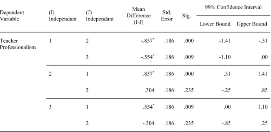
Tukey HSD post-hoc analysis was conducted to ascertain the differences between the three syllabi. To help clarify the reporting of the results, Syllabus 1 was the base version without design principles applied, Syllabus 2 contained the application of typographical hierarchy and cueing, and Syllabus 3 was the most designed version. Table 1 shows the results for one item, teacher professionalism.
Table 1 – Tukey Post Hoc Analysis of Impressions of the teacher
Dependent
Variable (I)
Independant (J) Independant
Mean Difference
(I-J) Std.
Error Sig.
99% Confidence Interval Lower Bound Upper Bound
Teacher
Professionalism 1 2 -.857* .186 .000 -1.41 -.31
3 -.554* .186 .009 -1.10 .00
2 1 .857* .186 .000 .31 1.41
3 .304 .186 .235 -.25 .85
3 1 .554* .186 .009 .00 1.10
2 -.304 .186 .235 -.85 .25
*p<.01
The post hoc Tukey test showed that ratings of Syllabus 1 differed significantly from Syllabus 2 and Syllabus 3 at p<.01. Syllabus 2 and Syllabus 3 were not shown to be significantly different. This trend was true for all of the four total questions about the teacher. Two of the three items rating the university, the beauty of the university campus as well as whether the university was a good place to study, also followed the same trend, Syllabus 1 differing
significantly from both Syllabus 2 and Syllabus 3.
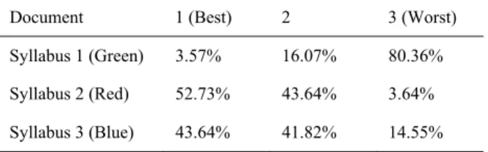
Participants’ preferences for syllabi followed the same trend, with post hoc analysis showing that Syllabus 1 differed from both Syllabus 2 and Syllabus 3, but finding no statistical significance between preference for Syllabus 2 and Syllabus 3 (see Table 2).
Table 2 – Ranking of the Three Documents
Document 1 (Best) 2 3 (Worst)
Syllabus 1 (Green) 3.57% 16.07% 80.36%
Syllabus 2 (Red) 52.73% 43.64% 3.64%
Syllabus 3 (Blue) 43.64% 41.82% 14.55%
Discussion
Design and assessments of instructor and institution
The data indicate that design plays an important role in the initial contact phase with a text.
Strong statistical significance suggests with a high degree of confidence that ratings of teachers and institutions are influenced by design. Participants rated the instructor on all four criteria (professionalism, preparedness, care, teaching ability) higher for both Syllabus 2 and Syllabus 3. Both syllabi differed from Syllabus 1 only in terms of the design principles applied, not content. This finding has broad implications in the field of education. If teaching is to take place effectively, students need to respect their instructors and trust that they are sufficiently qualified in their position. The most effective instruction takes place after rapport has been established.
Cognitive confirmation bias is a central factor of rapport as “In the presence of a very positive first impression, a person may disregard or downplay possible negative issues encountered later”
(Lingaard, Fernandes, Dudek, & Brown, 2006, p. 115). The current study shows that design
plays a role in creating the initial impression of the teacher. However, it must be noted that it is difficult to ascertain and quantify the precise contribution of avariable when there are so many other factors present. The data do show that before students have even seen a large enough sample of instructor performance to make informed judgements, they are already forming opinions.
Data concerning the university (beauty, a good place to study) is quite similar with ratings obtaining significance between Syllabus 1 and the other two syllabi. In the case of the ratings of beauty, it seems self-evident that a more beautiful design would translate into higher rankings of beauty, as the concepts directly translate. Whether the university is a good place to study is quite an important impression. As students are stakeholders in their educational process, their perception of educational quality is connected with the value that they feel they receive from their education. Carefully crafted texts show a level of investment in the content to be taught.
Interestingly enough, only one item, whether the university was high level, was not significant.
This is particularly interesting when contrasted with all the other significant items, as it indicated that students may not expect high level institutions to employ good design. Rather, it may be that the contents of the courses are more important than the wrappings they are presented in. The context of tertiary education in Japan may also offer an explanation for this interesting result. The most prestigious and highly ranked institutions in Japan are public, and due to the combination of level and low cost, are always in demand. On the other hand, private institutions must compete for applications and therefore may place more emphasis on the presentation and marketing of their institutions.
Key design elements for text creation
The data demonstrate that participants may adjust their assessments based on the design of a document. It is important to apply these findings to materials development practice for the classroom. The key design elements of Syllabus 2 and Syllabus 3, in conjunction with a comparison to the features of Syllabus 1, can help provide clear criteria for developing materials that can add to more positive initial judgments. The greatest difference between the syllabi was the degree to which they established a clear hierarchy of information. Syllabus 1’s design flaw is a lack of clear hierarchical cues to guide learners through the document. There is no clear system of headings and subheadings to serve as waypoints in the reading process.
Furthermore, inconsistent alignment creates a meandering reading path, which may be difficult to follow. In contrast, both other syllabi have a clear system of hierarchy established through an easily identifiable system of headings, subheadings, and consistent, clean alignment. While all data collected in this study is concerning a specific text type, syllabi, the findings can be applied to any text with the similar purpose of conveying information in a concise manner.
Limitations
Participants in this study were all from a Japanese international university. The university context, as well as the unique features of the Japanese educational system, may mean that the data has limited applicability in other contexts. Replication is recommended for the purpose of enlarging applications of the data.
Furthermore, the personal experiences of the participants may have informed their ratings.
Possibly, the texts may have resembled something they had seen before and activated a preconceived judgment on the subject. Furthermore, participants’ exposure to English course materials during their two years of study may have had a strong influence. It may prove
interesting to try the study on incoming first year students, who have not yet been exposed to university materials.
In addition, the data was collected immediately following exposure to the texts so it does not provide information about the prolonged effect of design on impressions of instructors and institutions.
Finally, in an ideal situation, rather than participants putting themselves in a hypothetical context, more meaningful data could be collected if students were given the different syllabi at the start of a course. This, of course, has many ethical implications and would possibly disadvantage both the students and the instructor. The data has a more limited application as it stems from a hypothetical situation, which may be different from reality.
Conclusions
Materials development is a complex multi-faceted practice that is ingrained in modern education. The ubiquity of materials development alone is proof of its importance, though the complex nature of materials causes inherent difficulties in studying the effect of materials on the learning process. Success of materials in any medium is a result of interplay between the content itself, the mode of delivery, and design. Design factors in extremely quickly in the consumption process, coloring any future content through a filter. This filter may even extend beyond the materials to the perceptions of any parties or entities connected with the materials.
The current study has demonstrated a tenable connection between materials design and impressions of instructors and institutions. However, there is still more work to be done.
Combining the insights and wisdom of well-developed fields such as design and marketing with education will help us to better understand the effects of materials design and produce
better educational materials.
References
Canning, J. (2004). Language and design. Linguistics and Area Studies Good Practice Guide.
Retrieved June 8, 2014, from http://www.llas.ac.uk/resources/gpg/2241
Coles, P., & Foster, J. (1975). Typographic cueing as an aid to learning from typewritten text.
Programmed Learning & Educational Technology, 12, 102-108.
Doermann, D., Rivlin, E., & Rosenfeld, A. (1996). The function of documents. Institute for Advanced Computer Studies. College Park: Language and Media Processing Labratory.
Foster, J. (1979). The use of visual cues in text. In P. Kolers, M. Wrolstad, & H. Bouma (Eds.), Processing of Visible Language (Vol. 13, pp. 189-203). New York: Plenum Press.
Krause, J. (2016). Lessons in Typography: Must-know typographic principles presented through lessons, exercises, and examples. New Riders.
Lege, R. (2016). Designed text and SLLs’ reading processes: An eye tracking study. Studies in Linguistics and Language Teaching, 1-25.
Lentz, L., & Pander Maat, H. (2004). Functional analysis for document design. Technical Communication, 51(3), 387-398.
Lingaard, G., Fernandes, G., Dudek, C., & Brown, J. (2006). Attention web designers: You have 50 milliseconds to make a good first impression! Behavior & Information Technology, 5(2), 115-126.
Lupton, E. (2014). Thinking with Type: A critical guide for designers, writers, editors, &
students. San Francisco: Chronicle Books.
Nickerson, R. (1998). Confirmation bias: A ubiquitous phenomenon in many guises. Review of General Psychology, 2(2), 175-220.
Nisbett, R., & Ross, L. (1980). Human Inference: Strategies and Shortcomings of Social Judgment. Englewood. Cliffs, New Jersey: Prentice Hall.
Philiastides, M., & Ratcliff, R. (2013). Influence of branding on preference-based decision making. Psychological Science, 1208-1215.
Puskarevic, I., Nedeljkovic, U., & Pintjer, I. (2013). Typeface persona: A review study. XIth Symposium on Graphic Arts, 156-160.
Schriver, K. (1997). Dynamics in Document Design: Creating Text for Readers. New York:
Wiley.
Silayoi, P., & Speece, M. (2007). The importance of packaging attributes: a conjoint analysis approach. European Journal of Marketing, 41(11/12), 1495-1517.
Van Rompay, T. J., Pruyn, A. T., & Tieke, P. (2009). Symbolic meaning integration in design and its influence on product and brand evaluation. International Journal of Design, 3(2), 19-26.
Waller, R. (1991). Typography and discourse. In R. Burr, M. Kamil, P. Mosenthal, & P.
Pearson (Eds.), Handbook of reading research (Vol. 2, pp. 341-380). New York:
Routledge.
Williams, R. (2006). The Non-Designer’s Type Book. Berkeley: Peachpit Press.