Doctoral Dissertation
Shibaura Institute of Technology
Perceptions of Colored Pictograms
for Communication in
Factory Emergencies
March 2019
Perceptions of Colored Pictograms for
Communication in
Factory Emergencies
BY
Suopor Hiranchiracheep
A DISSERTATION SUBMITTED IN PARTIAL FULFILLMENT OF THE REQUIREMENTS FOR THE DEGREE OF
DOCTOR OF PHILOSOPHY
IN THE
FUCTIONAL CONTROL SYSTEMS
GRADUATE SCHOOL OF ENGINEERING AND SCIENCE SHIBAURA INSTITUTE OF TECHNOLOGY
i
Declaration of Authorship
I, Suopor HIRANCHIRACHEEP, declare that this thesis titled, “Perceptions of Colored Pictograms for Communication in Factory Emergencies,” and the work presented in it are my own. I confirm that:
This work was done wholly or mainly while in candidature for a research degree at Shibaura Institute of Technology.
Where any part of this thesis has previously been submitted for a degree or any other qualification at Shibaura Institute of Technology or any other institution, this has been clearly stated.
Where I have consulted the published work of other, this is always clearly attributed. Where I have quoted from the work of others, the source is always given. With the
exception of such quotations, this thesis is entirely my own work. I have acknowledged all main sources of help.
Signed: ___________________________________ (Suopor HIRANCHIRACHEEP)
ii
Abstract
Pictograms are very useful for communication, not only with those who speak different languages but also with an environment in different job ranks. In many manufacturing settings, companies have implemented warning pictograms to ensure they don’t get any accidents or/and to get much higher production efficiency. Therefore, Comprehension of warning pictograms has become an important indicator of safety measures.
This study examined the effects of cultural and educational background factors on the comprehension of coloured pictograms for emergency situations in manufacturing environments. Pictograms should promptly communicate particular conditions to people who may not share a common language. The author designed coloured pictograms for such manufacturing tasks as push, step, and turn and then present them to factory workers having different cultural and educational backgrounds. A questionnaire survey was conducted to identify the behaviour patterns of subjects viewing seven differently coloured pictograms: white, black, red, yellow, green, blue, and pink. Questionnaire responses were obtained from 138 worker subjects, where the instructions were expressed in their native languages from three different countries: Thailand, Myanmar, and Cambodia. Moreover, the questionnaire was presented to 80 Japanese students and 178 Thai students in English instructions.
iii
iv
“Education is one of the country's most important jobs. Either prosperity or deterioration of a country depend mainly upon the citizent's education. Hence, the strenghtened education is indeed needed.”
v
Acknowledgments
I realize that the fulfillment of Ph.D. task is a collective effort, which involves the guidance, cooperation, support and. Dozens of people have helped and encouraged me immensely. I would like to sincerely express my appreciation to all people who have made this dissertation possible. I’ll never forget what they’ve done for me.
It is with immense gratitude that I acknowledge the support and help of my supervisors, Prof. Atsuko K. Yamazaki, Ph.D. (Main-charge) who continually and convincingly conveyed a spirit of adventure in regard to research and performance a professional lecturer. She, especially, assisted me overcome many crisis situations and give me the opportunity to achieve a better life. Definitely, this dissertation would not have been accomplished without her. She still contributed and extended her valuable assistance to achieve in a memorandum of understanding (MOU) between Shibaura Institute of Technology (SIT) and Nakhon Ratchasima Rajabhat University (NRRU).
Moreover, my deepest thanks and appreciation to Prof. Hiroshi Hasegawa, Ph.D. (Sub-charge) advise me how to succeed this research. I would like to extend my gratitude to the rest of my dissertation committee: Prof. Masahiro Inoue, Prof. Kazunori Mano and Prof. Vichai Saechout for their insightful comments. I am appreciatively indebted to them for their very valuable comments even at during their difficult times.
vi
international environment and with people from all over the world. Their friendship and good humor which had made my life much more enjoyable. In the future, I would bring my good skill learnt by SIT system to my job at NRRU and become a great supervisor to my students.
I am grateful to Mr. Chitapong Wechtaisong, Ms. Sarunya Kanjanawattana and Ms. Tipporn Laohakangvalvit for their kindly guidance, generousness, help and friendship that I needed. In particular, I thank Diversity Communication Laboratory members and admirable working atmosphere of this laboratory, Thai friends in SIT or Thailand. I would also like to thank all the participants for their cooperation in my research.In addition,I still get positive attitude to be a good person in order to create excellent stories from Mr. Palitchoke Ayanaputra as role models.
vii
Contents
Declaration of Authorship ... i Abstract ... ii Acknowledgments ... v Contents ... viiiiList of Figures... iix
List of Tables ... xi
Chapter 1 Introduction ... 1
1.1 Motivation ... 2
1.2 Problem Statement ... 4
1.3 Objective ... 4
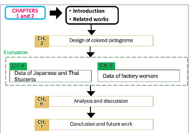
1.4 Structure of This Dissertation ... 4
Chapter 2 Related Works... 7
2.1 Introduction of Pictograms ... 7
2.2 Cultural Difference ...16
2.3 People with Low Education ...19
2.4 Workers with Lower Education in Manufacturing Settings ...23
2.5 Discussion...24
2.6 Conclusion ...25
Chapter 3 Design of Colored Pictograms ... 27
3.1 Designing Pictograms ...27
3.2 Choosing Color ...29
3.3 Designing Questionnaires ...29
3.4 Conclusion ...42
Chapter 4 Colored Pictogram Evaluation by Japanese and Thai Students ... 43
4.1 Participants ...44
4.2 Method ...45
4.3 Results ...47
4.4 Statistical Analysis ...49
viii
Chapter 5 Colored Pictogram Evaluation by Factory Workers ... 54
5.1 Participants ...54
5.2 Method ...55
5.3 Results ...57
5.4 Statistical Analysis ...61
Chapter 6 Analysis and Discussion ... 71
6.1 Overall Analysis and Discussion ...71
6.2 Education Levels on the Interpretation...72
6.3 Job Ranks of Workers and Career Directions ...73
6.4 Colour Recognition as an Important Means ...73
6.5 Low-Educated Workers as a Multi-Layer Chain Subcontracting System ...74
6.6 Training ...75
Chapter 7 Conclusion and Future Work ... 76
7.1 Conclusion ...76
7.2 Future Work ...77
References ...78
ix
List of Figures
Figure 1.1 Number of migrant workers from Myanmar and Cambodian in Thailand ... 3 Figure 1.2 Structure of this thesis ... 6 Figure 2.1 Pictograms for described actions in morning situations: in the morning, wake up,
wash a face, and brush teeth. ... 8
Figure 2.2 Safety pictograms of Public Information Symbols ... 12 Figure 2.3 Thirty pictograms questioned for cultural differences [40] ... 17
Figure 2.4 Icons and pictograms representing seven referents or functions of the
videotelephone [34] ... 18
Figure 2.5 Medication pictograms developed by the RAD-AR Council [45] ... 20 Figure 2.6 Good behavior and the safety characters of various designs for safety signs ... 24 Figure 3.1 Uncoloured pictograms for required actions in emergency situations: push a
button, step on a pedal, and turn a handle ... 28
Figure 3.2 Coloured pictograms for required actions of push a button ... 30 Figure 3.3 Introduction in the first section of the online questionnaire ... 34 Figure 3.4 Questions of personal information in the second section of the online
questionnaire ... 34
Figure 3.5 Dropdown menu of questions of personal information in the second section of
the online questionnaire ... 37
Figure 3.6 Each coloured pictograms for actions in the third section of the online
x
Figure 3.7 Introduction in Thai of paper-based questionnaire ... 41 Figure 4.1 Average importance values obtained of students for each pictogram colour from
two groups with different culture backgrounds ... 48
Figure 5.1 Average importance values obtained of workers for each pictogram colour from
xi
List of Tables
Table 2.1 Design principles of each type of International standards for safety signs: ISO
7010 [8]... 10
Table 2.2 Examples of Safety sign, reference number and referent of International standards for
safety signs: ISO 7010 [9] ... 11
Table 2.3 (a) Similar pictograms have not been incorporated in sign standards on internet
[11] [12] [13] ... 12
Table 2.3 (b) Similar pictograms have not been incorporated in sign standards on internet
[14] [15] [16] [17] ... 13
Table 2.4 Bottom for stopping Emergency on internet [18] [19] [20] [21] ... 14 Table 2.5 Similar pictograms of International standards for safety signs: ISO 7010 [9] ... 15 Table 2.6 Pictograms for an action combined with an illustration of an object [48] ... 24 Table 3.1 Option answer for question of “What is your type of industry or business?” and
“What is your job category?” ... 32
Table 3.2 Option answer for question of “What is your final education?”, “What is your
nationality?”, “What's your current country of residence?”, and “What is your native language?” ... 33
Table 4.1 Personal background data of student subjects: gender, age range, nationality, and
educational level ... 44
xii
Table 5.1 Personal background data of factory worker subjects: gender, age range,
nationality, and educational level ... 55
Table 5.2 One-way ANOVA results among three pictograms for each colour ... 62
Table 5.3 One-way ANOVA results among seven colours for each pictogram ... 66
Chapter 1
Introduction
1.1 Motivation
Many companies have increased their global manufacturing production and moved such facilities to countries with lower labour costs to achieve optimal total cost. Under such circumstances, employees from various cultural and language backgrounds often work in teams, especially in manufacturing settings in Southeast Asian countries. It is a sub region of Asia, roughly be described as geographically situated east of the Indian subcontinent, south of China and north of Australia, between west of the Indian Ocean and the east of Pacific Ocean. Southeast Asian country is composed of eleven countries of impressive diversity in religion, culture and history: Brunei, Burma (Myanmar), Cambodia, Timor-Leste, Indonesia, Laos, Malaysia, the Philippines, Singapore, Thailand and Vietnam. Figure 1.1 illustrates the statistical data of immigration data in Thailand from 2014 to 2017. A blue line in the line graph represents as the number of migrant workers from Myanmar. An orange line represents the number of migrant workers from Cambodian. The total number of migrant workers for Myanmar and Cambodian presents as a green line. Based on the statistical data, the trend of foreign workers migration was up dramatically, especially in 2017. The number of migrant workers from Myanmar was much higher than the number of migrant workers from Cambodian since 2014.
1.2 Problem statement
In actual workplaces, an organization’s entire staff must comprehend the identical meaning of coloured signs to prevent injuries or to be clearly informed of possible danger. The meaning of a coloured pictogram that shows a required action in a factory emergency must be clearly understood by every single worker and manager, despite the workforce having different linguistic, cultural, or educational backgrounds. Therefore, coloured pictograms must be designed by taking into account a variety of culture- and education-based perceptions of colours and actions. In this study, the author developed new pictograms in different colours that clearly convey the meanings of operations required for emergency situations in manufacturing settings. The author focused on the perception of importance for actions expressed by coloured pictograms and investigated how different educational levels as well as the cultural differences of staff members affected subjects’ actions based on their perceptions of the depicted operations.
1.3
Objective
The purpose of this dissertation is to investigate the importance given by students and workers to the actions (push, step, and turn) represented by the seven coloured pictograms (white, black, red, yellow, green, blue, and pink) and to determine whether cultural backgrounds or educational levels affect the perceptions of the coloured pictograms in conveying procedures for emergency situations in manufacturing environments.
1.4
Structure of this dissertation
Chapter 2 presents literature reviews of existing researches in signs/pictograms, cultural difference, people with low education, and workers with lower education in manufacturing settings in safety field which are beneficial to contribute this dissertation. This survey is very necessary to achieve the dissertation goals.
In Chapter 3, overall questionnaire of pictograms for required actions and surveying with workers. It describes common actions to guide workers.
Chapter 4 presents results from respondents who were working at factory in Thailand and studying in Japan or Thailand.
Chapter 5 presents the statistical analyses on the data obtained from the survey. To examine whether the degree of importance given to each pictogram differed based on the three actions represented by the pictograms. Then, we analysed the differences in the degree of importance among the seven colours and finally tested each colour between the subject groups by t-tests to determine the culture and education differences.
Chapter 6 presents the discussion of this dissertation which discusses what this dissertation researched, evaluated, found, as well as solved. Furthermore, this chapter also discusses the new finding from this dissertation.
Chapter 2
Related Works
2.1 Introduction of pictograms
to represent a particular idea or concept. In many cases, however, all graphical and pictorial representations that are used to convey information and messages are referred to as “pictograms.”
Pictogram Ideogram Communication (PIC) is the most famous set of communication icons. It was developed by Subhas Maharaj [6], a Canadian speech therapist, to support communication for people with difficulties in oral and/or written communication. These PIC symbols were also published in Japan in 1995 after they were adapted to communication in Japanese. PIC symbols have been widely used and studied as a communication support tool for children with disabilities. They have also been used in online chatting between children speaking different languages [7]. Another example of pictograms developed for communication support is a set of approximately 300 symbols created in accordance with the Design Principles of Pictorial Symbols for Communication Support (JIS T0103), established by Japanese Standards Association (JSA) 2005 . While most of the JIS T0103-certified symbols represent objects and places, about 15 percent represent actions and movements in Figure 2.1. Some of them even express emotions. They are among those included in the JIS Design Principles of Pictorial Symbols for Communication Support.
Figure 2.1 Pictograms for described actions in morning situations: in the morning, wake up,
The principles of using colour in safety signs and pictograms have been developed. The principles of using colour in safety signs and pictograms have been developed by such organizations as the International Organization for Standardization (ISO), the Japanese Industrial Standards Committee (JISC), and the Industrial Accident Prevention Association. ISO 7010 prescribes design principles incorporating shapes and colours for safety signs. In these principles, red, yellow, blue, and green are respectively used for prohibitions or fire equipment, warnings, mandatory directions and escape routes, and safety conditions, as shown in Table 2.1 and Table 2.2 [8] [9].
According to the standards determined by JISC, red symbols denote “prohibited” or “stop” messages [10] (Figure 2.2). Although these colour standards have been incorporated in sign standards for creating pictograms at organizations and factories, pictograms drawn in red, yellow, and green still convey different meanings, which have not been united standards at many workplaces, are shown in Table 2.3 [11] [12] [13] [14] [15] [16] [17] and Table 2.4. In addition, there are similar pictograms in emergency situation of International standards for safety signs: ISO 7010 in Table 2.5 [9].
Table 2.1 Design principles of each type of International standards for safety signs: ISO
7010 [8]
Type of Sign Shape Design Pictogram
Prohibitive
Action/Equipment which are prohibited
Circular Black pictogram on white background with red border and diagonal line
Warning
These signs give warning of potential risks
Triangular Black pictogram on yellow background with black border
Mandatory
A course of action which must be taken
Circular white pictogram on blue background
Escape routes
And safety equipment
Rectangular or Square
white pictogram on green background
Fire Equipment
Location of fire fighting equipment
Table 2.2 Examples of Safety sign, reference number and referent of International standards
for safety signs: ISO 7010 [9]
Category E F M P W Evacuation route, location of safety equipment or safety facility, safety action Fire equipment signs Mandatory action signs Prohibition
Table 2.3 (a) Similar pictograms have not been incorporated in sign standards on internet
[11] [12] [13]
Meaning Pictograms URL
Emergency call point
https://borehamwood-signs.co.uk/collections
Fire door
https://signmaker.blog/2018/08/09/fire- safety-signs-does-it-apply-to-me-and-my-business/
Fire exit
https://www.shutterstock.com/image- vector/green-safety-sign-vector-emergency-
Table 2.3 (b) Similar pictograms have not been incorporated in sign standards on internet
[14] [15] [16] [17]
Meaning Pictograms URL
Fire extinguisher https://www.riigiteataja.ee/en/eli/518112015
005/consolide
Emergency telephone
https://www.riigiteataja.ee/en/eli/518112015 005/consolide
Emergency exit
https://pixabay.com/en/output-exit-emergency-exit-note-476122/
Fire escape exit sign
Table 2.5 Similar pictograms of International standards for safety signs: ISO 7010 [9]
Meaning Pictograms
Emergency stop button
Emergency telephone
Fire alarm call point
Fire emergency telephone
regarded as effective means of communication at companies where many workers from various countries and different cultural backgrounds work, since they can be used to improve occupational risk prevention at manufacturing sites. Therefore, many health and safety training or educational programs for employees at manufacturing companies include learning about pictograms and signs. Yamazaki and Taki indicated that well-designed pictograms for an action combined with the object conveyed meaning effectively, where safety and productivity are significant [31]. Hiranchiracheep el al. examined the effects of educational and cultural backgrounds on colored pictogram instructions in terms of behavioral perception for actions in manufacturing. The results showed a significant difference among groups with different educational backgrounds [32].
There have also been studies conducted on how to use pictograms to show the parameters of special analytical instruments [33] [34] [35] [36]. As the use of pictograms is spreading, an increasing number of studies are being conducted to review them, not only in terms of their shapes but also in terms of their colors and presentation methods, so that they can be used universally [37] [38] [39]. In a study by Waterson et al. they gathered evaluation data from more than 200 young children to evaluate new safety pictograms [37]. Through the summative assessment of the effectiveness of the new pictograms, particularly in an example of formative evaluation, they outlined a useful set of guidelines for designing safety signs for young children.
2.2 Cultural difference
Figure 2.3 Thirty pictograms questioned for cultural differences [40]
Figure 2.4 Icons and pictograms representing seven referents or functions of the
videotelephone [34]
2.3 People with low education
2.3.1 Adults with low education
The studies of medication pictograms have focused on elderly patients with low literacy who display declining cognitive abilities and memory. Therefore, the comprehension of pictograms can assist in the care of the elderly in order to establish methods to convey medication instructions. Among the studies on the comprehension of medication pictograms, those conducted by Mansoor and Dowse [22] and Dowse and Ehlers [41] are particularly well known. Both studies assessed the effectiveness of pictograms in showing how to take and store medicines in African countries with low literacy rates. The results suggested that the US-designed pictograms that had been deemed effective were not interpreted in the same way in South Africa and that medication pictograms would need to be designed with consideration of cultural context. Knapp et al. [42] examined whether the medication pictograms used in South Africa and the US could be understood by patients in the UK. The results showed that for both the US and South African versions, only three of the 10 pictograms were understood by more than 85 percent of the subjects. Meanwhile, Cho [40] developed rather complicated pictograms by themselves and showed them to subjects, some US nationals and some Japanese nationals, to analyze the differences in their interpretations. The results indicated that different cultural backgrounds could cause different interpretations of pictograms.
prescriptions. As of 2006, a total of 51 pictograms had been developed. Some pictograms were combined to illustrate medication instructions.
Figure 2.5 Medication pictograms developed by the RAD-AR Council [44]
Rapid Estimate of Adult Literacy in Medicine: REALM-D) were asked to verbally explain the meaning of each pictogram. The results of the study indicated that adequately literate participants could more easily understand pictograms than people with low literacy. Five pictograms of the adequately literate group and two pictograms of the low-literacy group reached 67% understanding for the ISO cut-off. Designing pictogram characteristics should focus on familiarity, simplicity, and showing the intake and effect of medicine.
The United States Pharmacopeia Convention (USP) developed 81 pharmaceutical pictograms as ‘standardized graphic images that help convey medication instructions, precautions and/or warnings to patients with a lower level reading ability and patients for whom English is a second language. The USP pictograms have been tested for comprehension by Ng et al. [26]. They examined comprehension of USP pictograms for older Hong Kong residents (65 and above). The first group was presented with text labels and another group with the text labels plus supplementary pharmaceutical pictograms. This study showed that older people favored the addition of pharmaceutical pictograms to written text for conveying medical information. Zargarzadeh and Ahamdi [45] investigated the understandability of three pictograms selected as most applicable by participants and their recall after educational mini-sessions. The groups with lower levels of literacy had more difficulty interpreting them than those with a high level of literacy.
2.3.2 Children with low education
Frame, Octagonal Frame, Inverted Triangle Frame), and stronger recognition of the color “Red” among all warning colors (Orange, Red, Green, Blue, Black). In addition, they associated them with familiar objects. Waterson et al. [37] analyzed various designs for safety signs and accident rate data on board trains for children (aged five-10). The result showed that posters and labels were given a blue background and the colour yellow was used for the background text in order to maximize the contrast between pictures and text as requested by the children. Moreover, to reinforce good behavior and the safety characters, the characters were always put on the “good” circle and never overlapped with pictograms highlighting bad behavior.
Figure 2.6 Good behavior and the safety characters of various designs for safety
Korenevsky et al. [39] recruited adolescents (aged 12-18) from the volunteer organization of the Children’s Hospital of Eastern Ontario (CHEO) in Ottawa, Ontario, as well as from a youth organization at the hospital to identify the common graphic elements for defined categories of pictograms and identify the key graphic elements common to all pictograms. For all 21 pictogram categories, at least 80% of survey respondents agreed that the storyboard conveyed the intended meaning. The result indicated that the context in which pictograms are presented is important to their correct interpretation. Categories had few preferred pictograms such as “take with an empty stomach”, “take one tablet”, or “do not take if breastfeeding”.
2.4 Workers with lower education in manufacturing settings
Table 2.6 pictograms for an action combined with an illustration of an object [47]
2.5 Discussion
The American National Standards Institute (ANSI) as the American standard and the International Organization for Standardization (ISO) as the European standard have been developed to mitigate this issue[50] [51]. They have laid a foundation for the JIS-certified public information symbols. However, these ANSI, ISO and JIS standards cannot be applied to many pictograms. The uniform design principles set for public information symbols by the ISO Technical Committee on Graphical Symbols cannot eliminate regional differences [5]. The study conducted by Kostelnick on the influence of cultural context on the comprehension of pictograms and pictographs indicated that the proper selection of information signs would depend on the familiarity of the symbols included in the signs to people in that culture as well as the complexity of cultural backgrounds of the target group, particularly when applying pictograms to children.
Tzeng et al. also assessed the recognition of pictograms from a psychological perspective. The results suggested that the test subjects preferred pictogram designs similar to those traditionally used in their home countries. Many other studies also showed that people’s comprehension of pictograms could be greatly affected by their familiarity with the symbols and symbolic elements included in the pictograms. Therefore, it is thought that each pictogram should be carefully examined as to whether it will be easily understood by the target group in the intended situation
2.6 Conclusion
Chapter 3
Design of Colored Pictograms
3.1 Designing pictograms
handle denote the turn action. Pictograms for taking actions are usually represented by black symbols or black lines, but the author used other colours for the parts of the pictograms that represent the verb of the action in order to investigate the effects of colour on the subject’s perception of the importance of the action. Figure 3.1 shows the basic, uncoloured pictograms for actions in emergency situations at factories.
Figure 3.1 Uncoloured pictograms for required actions in emergency situations: push a
3.2 Choosing color
From the principles of using colour in safety signs and pictograms, the principles of using colour in safety signs and pictograms have been developed by such organizations as the International Organization for Standardization (ISO), the Japanese Industrial Standards Committee (JISC), and the Industrial Accident Prevention Association. ISO 7010 prescribes design principles incorporating shapes and colours for safety signs. In these principles, red, yellow, blue, and green are respectively used for prohibitions or fire equipment, warnings, mandatory directions and escape routes, and safety conditions [8] [9] . Moreover, pink signs are appeared online as emergency sign [52] [53].
Therefore, the author chose seven colours for the action parts of each pictogram: white, black, red, yellow, green, blue, and pink. Other parts of the pictograms were drawn in black. Consequently, the author created a set of seven differently coloured pictograms for each action. Figure 3.2 shows each coloured pictograms for push actions in emergency situations at factories.
3.3 Designing questionnaires
Figure 3.2 Coloured pictograms for required actions of push a button (in white, black, red,
3.3.1 Web-based questionnaires
The author created an online questionnaire to collect the data for analysis as follows. 1. Introduction in the first section,the author described this survey: objective and how to (Figure 3.3).
2. Questions of personal information in the second section, subjects were asked as follows (Figure 3.4).
gender and age
What is your type of industry or business? What is your job category?
What is your final education? What is your nationality?
What's your current country of residence? What is your native language?
3. Each coloured pictograms for actions in the third section (Figure 3.5), subjects were asked how effectively coloured pictograms can convey the importance of the action represented by each pictogram as follows (Figure 3.4).
How much do you think it is important to push? How much do you think it is important to step? How much do you think it is important to wheel?
Table 3.1 Option answer for question of “What is your type of industry or business?” and
“What is your job category?”
What is your type of industry or business?
What is your job category?
Agriculture and forestry/Fishing industry/Mining
Construction/Architecture/Civil engineering
Machinery-related manufacturing Materials and chemical-related
manufacturing
Electrical and electronics-related manufacturing
Other manufacturing industries Electricity supply
Gas and water supply
Information and communication industry
Transportation industry Wholesale/Retailing Finance/Insurance Real estate business
Restaurant/accommodation Medical care/Welfare Education/Learning support Other services
Public service
Others (Please specify)
Table 3.2 Option answer for question of “What is your final education?”, “What is your
nationality?”, “What's your current country of residence?”, and “What is your native language?”
What is your final educational level?
What is your nationality? and What's your current country of residence?
What is your native language?
1. Junior high school student 2. Junior high school graduate 3. High school student
4. High school graduate
5. University or College student 6. University or College graduate 7. Master's course student
8. Master's course graduate 9. Graduate doctoral student
10. Graduate School of doctoral graduates
11. Others (Please specify)
Japan Thailand Malaysia Philippines Vietnam Indonesia Cambodia Laos Singapore China Brazil
Others (Please specify)
Figure 3.3 Introduction in the first section of the online questionnaire
Figure 3.4 Questions of personal information in the second section of the online
(a) Dropdown menu of industry type or business type
(c) Dropdown menu of education
(e) Dropdown menu of native language
(f) Dropdown menu of current country of residence
Figure 3.5 Dropdown menu of questions of personal information in the second section of
(c) Each coloured pictograms of turn handle
Figure 3.6 Each coloured pictograms for actions in the third section of the online
3.3.2 Paper-based questionnaires
The author created a paper-based questionnaire to collect the data from Thai subjects with secondary school or vocational diploma and Burmese and Cambodian subjects with primary school educational level.
3.4 Conclusion
Chapter 4
Colored Pictogram Evaluation by
Japanese and Thai Students
Thailand and Japan. Therefore, a main factor to affect the perception of the colored pictograms was assumed to be differences in their cultures.
4.1 Participants
The questionnaire was presented to two groups: one group of Japanese university student subjects and another group of Thai student subjects. Eighty Japanese students (44 males and 36 females) responded to the questionnaire in which the instructions were expressed in Japanese, and their ages ranged from 18 to 22 years. None of the Japanese subject had worked at a factory by the time of this study.
Table 4.1 Personal background data of student subjects: gender, age range, nationality, and
As for the group of Thai student subjects who responded to the questionnaire, their ages ranged from 18 to 37 years, and 178 subjects participated in this study (78 males, 95 females and 5 others), as shown in Table 4.1 They were given the same questionnaire with the instructions in Thai language
4.2 Method
4.2.1 Method of Japanese university student subjects
The following are the questionnaire procedures:1. The author had explained the introduction of my research in the first section of the questionnaire and each parts of questionnaire.
2. All subjects were asked to answer questions for each subject’s personal information in the second section of the questionnaire.
2.1. sex, 2.2. age, 2.3. major
2.4. the length of study at SIT
3. After that, they answer the questionnaires to indicate how important each pictogram was by marking its percentage on the scale ranging from 0 to 100 in the questionnaireas follows:
3.1. ‘push’ a button with each colors : white, black, red, yellow, green, blue and pink
3.2. ‘step’ on a pedal with each colors : white, black, red, yellow, green, blue and pink
3.3. ‘wheel’ a handle with each colors : white, black, red, yellow, green, blue and pink
4.2.2 Method of Thai university student subjects
The following are the questionnaire procedures by online:1. A lecturer had explained the introduction of my research and each part of questionnaire on internet.
2. For the first page, all subjects found objective of the online questionnaires. 3. For the second page, they had filled out and selected personal information as
follows: 3.1. sex, 3.2. age,
3.3. type of industry or business 3.4. job category: major
3.5. education 3.6. nationality 3.7. native language
3.8. current country of residence
4. For the third page, they answer the question of each pictogram whose difference seven colors as “how much do you think it is important to push?”
5. For the third page, they answer the question of each pictogram whose difference seven colors as “how much do you think it is important to step?”
6. For the third page, they answer the question of each pictogram whose difference seven colors as “how much do you think it is important to wheel?”
4.3 Results
After the author received responses from all subjects, the author averaged the scores for each pictogram and also performed bar graphs to see there were tendency in the levels of reception among the colored pictograms as well as the subject groups. The author collected 258 responses from Japanese and Thai subjects. Figures 2 (a) and (b) presents the average values obtained from the subjects. We divided the results into two graphs by nationality; (a) Japanese and (b) Thai. Each graph shows seven categories of colours; white, black, red, yellow, green, blue and pink.
(b) Thai students Subjects
Figure 4.1 Average importance values obtained of students for each pictogram colour from
two groups with different culture backgrounds
students interpreted the red pictograms as the most important for all actions represented by the pictograms. On the other hand, the Thai students regarded the green ones as the most important actions to take for emergency situations, and they rated the red pictograms as the second-most important. However, the difference between the average scores given to the green and red pictograms by the Thai subjects was small for all actions. The average scores given by the Japanese students were very close to the ones given by the Thai students for the black, yellow and pink pictograms. The pictograms in white were interpreted the least important by both Thai and Japanese students.
4.4 Statistical analysis
The author performed the following statistical analyses on the data obtained from the survey of Thai and Japanese students. To examine whether the degree of importance given to each pictogram differed based on the three actions represented by the pictograms (push, step, and turn), we computed a one-way analysis of variance (ANOVA) among the actions for each nationality group. Then, the authors tested each colour between the subject groups by t-tests to examine whether there is a difference between the two group in terms of their perceptions of the colored pictograms
4.4.1 One-way ANOVA results among the actions
Table 4.2 One-way ANOVA results of students among three pictograms for each colour
(a) Japanese students
White Black Red Yellow Green Blue Pink Meaning ofpush pictogram 29.13 59.31 85.19 56.44 36.63 37.69 41.06 MS (within groups) 23.75 58.31 81.25 58.56 38.81 40.88 40.38 MS (within groups) 33.81 59.25 80.44 57.13 42.19 41.94 39.50 F* 4.295 0.043 1.707 0.231 2.167 1.211 0.112 P** 0.015 0.958 0.184 0.794 0.117 0.300 0.894 MS (among groups) 2028.229 25.104 516.354 94.063 628.229 391.354 49.063 MS (within groups) 472.261 588.563 302.561 407.418 289.844 323.252 438.622
(b) Thai students
White Black Red Yellow Green Blue Pink Meaning of push pictogram 35.47 51.53 57.96 46.96 55.73 55.19 49.18 Meaning of step pictogram 30.36 53.70 52.80 46.42 58.63 53.87 45.66 Meaning of turn pictogram 37.42 53.63 53.66 45.67 56.31 52.06 43.62 F* 2.655 0.281 1.099 0.132 0.602 0.624 1.69 P** 0.071 0.755 0.334 0.877 0.548 0.536 0.186 MS (among groups) 2366.511 269.871 1360.097 74.904 418.946 440.934 1406.642 MS (within groups) 891.180 958.872 1237.505 568.831 695.613 706.522 832.373
4.4.2 T-test results between two pairs for each colour
Based on the results of the ANOVA tests, a t-test was performed between the Thai student group and the Japanese student group for each colour to see if there is a significant difference between the two groups in terms of the perception of the pictogram of an action according to a colour. Table 4.3 shows the result of a t-test preformed for each colour between the Japanese and Thai subjects. The test results show that there was a significant difference between the average scores of importance given by the Thai subject group and the Japanese subject group for red, yellow, green and blue pictograms.
Table 4.3 T-test results between two pairs of Thai and Japanese students for each colour
White Black Red Yellow Green Blue Pink
T 1.887 -1.959 -9.974 -4.522 7.507 5.539 2.06
Df 194.063 189.762 253.942 160.097 218.146 211.236 196.789
P 0.061 0.052 < 0.001a < 0.001a < 0.001a < 0.001a 0.041
4.5 Discussion and conclusion
Chapter 5
Colored Pictogram Evaluation by
Factory Workers
5.1 Participants
Twenty of the Thai subjects had graduate or undergraduate university degrees, and the rest had education levels of secondary or vocational schools. All of the Burmese and Cambodian subjects had primary school levels of education. Table 1 summarizes the personal background data of the subjects in the factory.
Table 5.1 Personal background data of factory worker subjects: gender, age range,
nationality, and educational level
Demographic Category
Nationality
Thais Burmese Cambodians
Gender Male 23 26 19 Female 17 14 21 Age 12–17 0 0 0 18–27 11 22 24 28–37 28 14 14 38–47 9 4 2 48 or above 10 0 0 Educational level Primary school 0 40 40 Secondary school 38 0 0 Vocational diploma 2 0 0 Graduate/under- graduate degree 18 0 0
5.2 Method
5.2.1 Method of low-educated workers
The following are the questionnaire procedures:and each part of questionnaire.
2. All subjects were asked to answer questions for each subject’s personal information in the first section of the questionnaire.
2.1. sex, 2.2. age, 2.3. Nationality 2.4. Primary language 2.5. Education 2.6. Position 2.7. Province
3. After that, they answer the questionnaires to indicate how important each pictogram was by marking its percentage on the scale ranging from 0 to 100 in the questionnaireas follows:
3.1. ‘push’ a button with each colors : white, black, red, yellow, green, blue and pink
3.2. ‘step’ on a pedal with each colors : white, black, red, yellow, green, blue and pink
3.3. ‘wheel’ a handle with each colors : white, black, red, yellow, green, blue and pink
4. The last question is in case they didn’t understand the procedure well, they can tell reasons (free description)
5.2.2 Method of high-educated Thai workers
The following are the questionnaire procedures by online:
1. A responsible woman had explained my research to each subjects privately, then sent the online questionnaire to them.
3. For the second page, they had filled out and selected personal information as follows:
3.1. sex, 3.2. age,
3.3. type of industry or business 3.4. job category : major
3.5. education 3.6. nationality 3.7. native language
3.8. current country of residence
4. For the third page, they answer the question of each pictogram whose difference seven colors as “how much do you think it is important to push?”
5. For the third page, they answer the question of each pictogram whose difference seven colors as “how much do you think it is important to step?”
6. For the third page, they answer the question of each pictogram whose difference seven colors as “how much do you think it is important to wheel?”
7. The last page is in case they didn’t understand the procedure well, they can tell reasons (free description)
5.3 Results
(a) Thai subjects with undergraduate or graduate degrees
(c) Burmeseand Cambodian subjects with primary school educational level
Figure 5.1 Average importance values obtained of workers for each pictogram colour from
5.4 Statistical analysis
The author performed the following statistical analyses on the data obtained from our survey of factory workers. To examine whether the degree of importance given to each pictogram differed based on the three actions represented by the pictograms (push, step, and turn), we computed a one-way analysis of variance (ANOVA) among the actions. Then, the author analysed the differences in the degree of importance among the seven colours by one-way ANOVA and finally tested each colour between the subject groups by t-tests to determine the culture and education differences.
5.4.1 One-way ANOVA results among the actions
Table 5.2 One-way ANOVA results among three pictograms for each colour
(a) Burmese respondents
White Black Red Yellow Green Blue Pink Meaning ofpush pictogram 50.50 48.75 0.00 19.75 100.00 69.50 0.25 Meaning ofstep pictogram 48.00 48.50 0.00 20.50 100.00 70.25 0.00 Meaning ofturn pictogram 50.50 49.25 0.00 19.00 99.00 69.00 0.00 F* 0.773 0.062 *** 0.137 1.000 0.107 1.000 P** 0.464 0.94 *** 0.872 0.371 0.898 0.371 MS (among groups) 83.333 5.833 0 22.500 13.333 15.833 0.833 MS (within groups) 107.863 94.231 0 164.509 13.333 147.415 0.833
* df (between groups) = 2 * df (within groups) = 117 ** α = 0.05
(b) Cambodian respondents
White Black Red Yellow Green Blue Pink Meaning of push pictogram 69.25 42.00 0.00 5.75 98.75 65.75 0.00 Meaning of step pictogram 66.50 32.75 0.00 3.25 100.00 63.25 0.00 Meaning of turn pictogram 72.50 37.00 0.00 4.00 100.00 62.00 0.00 F* 0.459 1.066 *** 0.592 1.000 0.538 *** P** 0.633 0.348 *** 0.555 0.371 0.585 *** MS (among groups) 360.833 857.500 0 65.833 20.833 145.833 0 MS (within groups) 785.791 804.081 0 111.239 20.833 270.897 0
* df (between groups) = 2 * df (within groups) = 117 ** α = 0.05
(c) Thai respondents, from low-educated workers
White Black Red Yellow Green Blue Pink Meaning of push pictogram 44.88 47.00 0.25 20.50 100.00 62.00 8.00 Meaning of step pictogram 47.25 47.75 1.00 22.25 99.25 57.25 11.75 Meaning of turn pictogram 44.25 47.00 3.00 23.00 92.25 62.00 7.25 F* 0.7 0.049 1.087 0.177 5.787 0.608 1.123 P** 0.499 0.952 0.340 0.838 0.004 0.546 0.329 MS (among groups) 100.208 7.500 80.833 65.833 730.833 300.833 232.500 MS (within groups) 143.157 153.654 74.338 372.03 126.282 494.679 206.966
(d) Thai respondents, from high-educated workers
White Black Red Yellow Green Blue Pink Meaning of push pictogram 20.78 42.89 49.67 42.11 44.50 43.39 40.67 Meaning of step pictogram 15.67 46.83 55.56 35.44 42.44 43.61 38.44 Meaning of turn pictogram 29.44 49.39 53.67 40.89 41.44 45.06 37.39 F* 1.201 0.13 0.085 0.292 0.041 0.017 0.06 P** 0.309 0.878 0.918 0.748 0.96 0.983 0.942 MS (among groups) 873.185 193.019 162.741 226.741 43.685 14.741 50.389 MS (within groups) 727.129 1483.344 1904.479 776.000 1062.772 864.265 837.426
5.4.2 One-way ANOVA results among seven colours
Table 5.3 One-way ANOVA results among seven colours for each pictogram Low-educated Burmese Low-educated Cambodians Low-educated Thais High-educated Thais Meaning of white pictogram 49.67 69.42 45.46 21.96 Meaning of black pictogram 48.83 37.25 47.25 46.37 Meaning of red pictogram 0.00 0.00 1.42 52.96 Meaning of yellow pictogram 19.75 4.33 21.92 39.48 Meaning of green pictogram 99.67 99.58 97.17 42.80 Meaning of blue pictogram 69.58 63.67 60.42 44.02 Meaning of pink pictogram 0.08 0.00 9.00 38.83 F* 1072.702 396.728 278.865 1.735 P** < 0.001a < 0.001 a < 0.001 a 0.119 MS (among groups) 54679.63 63003.84 43619.47 9965.764
5.4.3 T-test results between two pairs for each colour
Table 5.4 T-test results between two pairs of worker groups for each colour
a P-Value of IBM SPSS Statistics 24 program is 0.000.
* Program cannot be computed because the standard deviation of both groups is 0.
White Black Red Yellow Green Blue Pink
a) Low-educated Thais vs. High-educated Thais
T 5.611 0.149 -7.971 -2.932 10.678 2.526 -5.709
Df 56 56 56 56 56 56 56
P < 0.001a 0.882 < 0.001a < 0.001a < 0.001a < 0.001a < 0.001a
b) Low-educated Thais vs. Low-educated non-Thais
T 4.446 -1.503 -2.143 -3.549 2.834 2.169 -6.602
Df 118 118 118 118 118 118 118
P < 0.001a 0.136 0.034 < 0.001a 0.005 0.032 < 0.001a c) Low-educated Burmese vs. Low-educated Cambodians
T -5.401 3.312 * 7.248 0.156 2.358 1
Df 78 78 * 78 78 78 78
The key significance of our study is found in our result showing no statistical difference among the three action pictograms of each colour for each nationality. For groups of low-educated workers with different education levels (secondary school and vocational diploma) on the same factory floor, we found no significance, mostly because colours are so critical, explaining why we see such complicated ANOVA results. Thus, colour is the most important factor. For the following groups of workers, low-educated Burmese, low-educated Cambodians, and low-educated Thais, analysis among the coloured pictograms showed a very significant difference of p < 0.001 (Table 5.3). The green pictogram obtained the highest degree of importance from low-educated Burmese (mean importance value = 99.67 %), and the second-highest degree of importance was from low-educated Cambodians (mean importance value = 99.58 %). On the other hand, the results for the coloured pictograms from high-educated Thais showed no significant difference, where p = 0.119. The red pictogram obtained the highest degree of importance, and the black pictogram had the second-highest degree. In contrast, the white colour showed the lowest degree of importance.
In addition, the author addressed whether a significant difference existed among subject groups with varying cultural and educational backgrounds in terms of their degrees of importance (Table 5.4). T-tests (α=0.05) were performed for each colour among three pairs of subject groups: educated and high-educated Thais, educated Thais and low-educated non-Thais, and low-low-educated Burmese and low-low-educated Cambodians. The t-test results showed a very significant difference at the p<0.001 for each colour in all of the pairs. The author found that among the groups of low-educated and high-educated Thai workers, subjects who shared a culture but had different levels of education, the responses showed a significant difference of colour pairs, such as white, red, green, yellow, and pink. On the other hand, no significant difference was observed for the black pictograms in any pair.
Nevertheless, the results for all identically coloured pictograms for each pair with different cultural backgrounds but similar educational backgrounds showed very significant differences in both low-educated groups: low-educated Thais and low-educated non-Thais. This tendency was especially significant with white, yellow, and pink pictograms.
differences. Thus, the results of this study show that different interpretations of the meaning of coloured pictograms were more affected by educational background than cultural differences. The low-educated group did mark almost 100% for the green pictograms and 0% for the red, perhaps because these two groups (Burmese and Cambodians) interpreted the meaning of importance differently based on their surroundings, since their factory has many pictograms, including emergency exits, fire equipment signs, fire hose reels, warnings, and prohibitions. Thus, they are generally familiar with green and red pictograms.
Chapter 6
Analysis and Discussion
6.1 Overall analysis and discussion
signs are to make better decisions regarding safety issues, to make workers at factories aware of hazards, and to prevent injuries [57]. Raskin noted that a lack of understanding or a misinterpretation can lead to injury [58]. This study found that the degree of importance given to coloured pictograms did not convey the intended information to low-educated workers successfully, probably due to the lack of adequate training in symbolic representation. The results of this study and a note by Wogalter and Laughery [57], as well as a study by Raskin [58], suggest that an effective training program to promote the intended messages of such signs be conducted. Factory facilitators who are responsible for environmental health and safety training should provide appropriate educational programs for workers to acquire a knowledge of industrial signs and the intended meanings of their colors as a way to help prevent workplace accidents. Supervisor commitment to safety and performing the safety.
6. 2 Education levels on the interpretation
always be conscious of safety sign messages and be able to react to emergency situations, thus preventing accidents.
6. 3 A multi-layer chain subcontracting system
In manufacturing settings in Thailand, there is a multi-layer chain subcontracting system. Therefore, workers who have different cultural and educational backgrounds may work in the same company for a short time. The results of our study for low-educated temporary workers from different cultures showed that they inaccurately interpreted the coloured pictograms. This finding agreed with the results of Ma et al. [63], who noted that the high mobility of workers usually produces the dangerous concept that they have no responsibility for safety. Therefore, they might have a lower perception of risk than other workers, implying that they should become familiar with the use of safety signs and be able to easily interpret their correct meanings. The results here suggest the need to enhance subcontract workers’ awareness for risk perception and to build a culture of workplace and organizational safety through training. Lingard et al. suggested that safety culture was an important factor in reducing industrial injury rates [64]. It would be beneficial if environmental health and safety training facilitators could provide training and educational activities continuously for new workers, particularly for workers with lower educational levels. Even though subcontract workers are employed for a short time, such educational programs would train them to act appropriately based on the intended meanings of workplace pictograms.
than by educational differences. Therefore, using colors in pictograms was more effective than using pictograms without colors, since a degreeof culture independence could be achieved at higher levels offormal and informal education. As seen in Table 3, over 50% of the highest-educated group of Thai workers could correctly understand the meaning of the red pictograms. On the other hand, none of the low-educated subjects could give the correct meaning of red pictograms. For the highest educated group of Thai workers, red could be interpreted as having various meanings ranging from prohibition to encouragement. In contrast, the low-educated groups, including Thais, Burmese, and Cambodians, interpreted the red pictograms as actions that must be avoided. They might have interpreted red and pink pictograms simply as denoting prohibition. Therefore, it is important to understand that more literate participants interpreted red pictograms more correctly and that low-educated groups must become specifically aware of the use of colours in safety signs to prevent immediate threats to property and safety.
6.5 Job ranks of workers and career directions
coloured pictogram, it is very likely that workers with a higher educational level can also understand it. Activities and training aimed at such common understanding would not be so expensive but could help avoid burdensome countermeasures required after mistaken actions.
6.6 Training
Chapter 7
Conclusion and Future Work
7.1 Conclusion
significant difference among groups with different educational backgrounds. The author also analysed the data using one-way ANOVAs among seven colours for each pictogram and T-tests among pairs of worker groups for each colour. The author identified a statistically significant difference between educational and cultural backgrounds. Thus, my results show that differences in the interpretation of the meaning of coloured pictograms were more affected by educational backgrounds than by cultural differences. The interpretations of the lowest-educated groups were different from those of the high- educated ones. My results suggest that factory managers need to provide comprehensive on-the-job training on signs posted in factories, in particular to low-educated employees.
7.2 Future work
In my next study, the author plan to conduct an experiment to examine the perceptions of coloured pictograms by workers at a factory from physiological and neurological points of view. The author will conduct perception-reaction experiments with factory workers as subjects for coloured pictograms to identify how their comprehension of the pictograms can be affected by colours. Furthermore, the author will use an optical imaging technique to measure brain functioning when subjects react to different coloured pictograms. In the experiments, the author plan to present coloured pictograms to workers having different cultural and educational backgrounds in a factory. In addition, questionnaires for managers of the factory will be created to identify what factors cause exceptional differences among factory workers. The author also plans to interview managers for this purpose and offer possible guidance on developing training content for safety awareness.
References
[1] Eurostat: Accidents at work statistics. [online]. Available: http://ec.europa.eu/eurostat/statistics-explained/index.php/Accidents_
at_work_statistics (Accessed 1 May 2016)
[2] Yamazaki, A.K. and Taki, H. (2010) ‘An evaluation of pictograms for communication among Japanese-and Thai-speaking engineers working in manufacturing settings’ IPCC 2010: In Professional Communication Conference, IEEE International, pp. 357–364. [3] Ota Y. (1995). ピクト グラム の おは なし[A story of a pictogram, Japan Standards
Association] (in Japanese), Japanese Standard Association
[4] Diaz,S., Martinez, G., Ota, Y., Marcus, A.(2015) Iconicity: Pictograms, Ideograms, Signs for Utility, Usefulness and Pleasure, Promopress; Multilingual edition
[5] Ota Y. (2005). 国際安全標識のピクトグラムデザインの研究 [Research on pictogram designs of international safety signs] (in Japanese). Progress Report of University Joint Research. Japan: Tama Art University.
[6] Maharaji, S.C. (1980). Pictogram Ideogram Communication. The George Reed Foundation for the Handicapped.
[7] Shimizu, H. (2003). 視 覚 シ ン ボ ル の 心 理 学[Psychology of Visual Symbols] (in Japanese). Brain Publishing, Tokyo
[9] International standards: Graphical symbols — Safety colours and safety signs — Registered safety signs. [online]. available :
https://www.sis.se/api/document/preview/913377/. [Accessed 1 October 2015].
[10] The Foundation for Promoting Personal Mobility and Ecological Transportation: Public Information Symbols. [online]. available : http://www.ecomo.or.jp/barrierfree/
pictogram/picto_top.html. [Accessed 1 May 2016].
[11] Eu signs: emergency call point sign. [Online]. Available: https://borehamwood-signs.co.uk/collections. [Accessed 20 March 2017].
[12] Sign: Fire Safety. [Online]. Available: https://signmaker.blog/2018/08/09/fire-safety-signs-does-it-apply-to-me-and-my-business/. [Accessed 20 March 2017].
[13] Shutterstock: Fire exit. [Online]. Available: https://www.shutterstock.com/image-vector/green-safety-sign-vector-emergency-exit-150066827?irgwc=1&utm_medium =Affiliate&utm_campaign=Eezy%20Inc&utm_source=38919&utm_term=
www.vecteezy.com. [Accessed 20 March 2017].
[14] Requirements Concerning the Provision of Safety Signs in the Workplace: Fire Extinguisher. [Online]. Available: https://www.riigiteataja.ee/en/eli/518112015005/ consolide. [Accessed 20 March 2017].
[15] Requirements Concerning the Provision of Safety Signs in the Workplace: Emergency Telephone. [Online]. Available: https://www.riigiteataja.ee/en/eli/518112015005/ consolide. [Accessed 20 March 2017].
[16] Pixabay: Emergency Exit. [Online]. Available: https://pixabay.com/en/output-exit- emergency-exit-note-476122/. [Accessed 20 March 2017].
[17] Directional sign: Fire Escape Exit Sign. [Online]. Available: https://www.indiamart. com/proddetail/fire-escape-exit-sign-9845496333.html. [Accessed 20 March 2017]. [18] Linecad: emergency stop push button. [Online]. Available: https://www.linecad.com/
emergency-stop-push-button/. [Accessed 20 March 2017].
[19] Zerosigns: Emergency Stop. [Online]. Available: http://www.zerosigns.co.uk/shop/ safety-signs/health-and-safety/emergency-stop-green// [Accessed 20 March 2017]. [20] Stickerart: Emergency Stop Button. [Online]. Available: https://stickerart.com.au/
showproduct-emergency-stop-button-symbol.html. [Accessed 20 March 2017]. [21] Rotary Switches: Emergency Stop Sticker. [Online]. Available: https://www.yeint.fi/
en/electronics/switches-1/rotary-switches/emergency-stop-sticker-oe60mm. [Accessed 20 March 2017].


![Figure 2.2 Safety pictograms of Public Information Symbols [10]](https://thumb-ap.123doks.com/thumbv2/123deta/9766047.1850051/23.893.267.719.710.1077/figure-safety-pictograms-public-information-symbols.webp)
![Table 2.1 Design principles of each type of International standards for safety signs: ISO 7010 [8]](https://thumb-ap.123doks.com/thumbv2/123deta/9766047.1850051/24.893.138.778.241.1068/table-design-principles-type-international-standards-safety-signs.webp)
![Table 2.2 Examples of Safety sign, reference number and referent of International standards for safety signs: ISO 7010 [9]](https://thumb-ap.123doks.com/thumbv2/123deta/9766047.1850051/25.893.132.785.247.1122/table-examples-safety-reference-number-referent-international-standards.webp)
![Table 2.4 Bottom for stopping Emergency on internet [18] [19] [20] [21] Pictograms URL https://www.linecad.com/emergency-stop-push-button/ http://www.zerosigns.co.uk/shop/safety- signs/health-and-safety/emergency-stop-green/ https://stickerart.com.](https://thumb-ap.123doks.com/thumbv2/123deta/9766047.1850051/28.893.132.777.200.1086/stopping-emergency-internet-pictograms-emergency-zerosigns-emergency-stickerart.webp)
![Table 2.5 Similar pictograms of International standards for safety signs: ISO 7010 [9]](https://thumb-ap.123doks.com/thumbv2/123deta/9766047.1850051/29.893.244.678.210.842/table-similar-pictograms-international-standards-safety-signs-iso.webp)
![Figure 2.3 Thirty pictograms questioned for cultural differences [40]](https://thumb-ap.123doks.com/thumbv2/123deta/9766047.1850051/31.893.289.635.234.719/figure-thirty-pictograms-questioned-cultural-differences.webp)
